Summary for Two Variables
Looking at individual characteristics of states, such as marriage rate or population, is interesting. However,
examining two variables simultaneously gives additional information.
The plot (scatterplot) on the right summarizes life expectance and murder rates for the 50 US states and shows the relationship between
these variables.
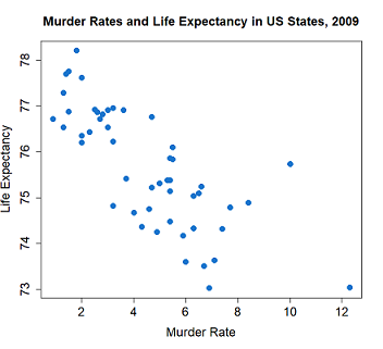
The x-coordinate of each plot indicates the life expectancy for the corresponding state while the y-coordinate indicates the murder rater for the same state. Looking at this plot, it is clear that states with low life expectancies also have higher murder rates and the states with lower murder rates have higher life expectancies.
In bivariate data, for each subject in the dataset there are measurements on two variables. Life expectancy and murder rate, as in the example above, are both numeric variables. Bivariate data can also consist of two categorical variables or a categorical variable and a numeric variable.
In bivariate data there are measurements on two variables for each subject.
Two Numeric Variables
Data on two numeric variables is usually displayed with a scatterplot. In a scatterplot, each subject is represented by one point where
the coordinates of the points are the measurements on the two variables.
The labeled point on the plot represents New Mexico. The 2009 murder rate in New Mexico was 10 per 100,000 and the life expectancy was 75.76 years.

A scatter plot shows a point for each observation such that the x-coordinate of the point is the value of one variable and the y-coordinate is the value of the other for that observation.
One Categorical and One Numeric Variable
Boxplots facilitate looking at the distribution of a numeric variable across levels of a categorical variable.

Association is not Causation
An association between variables is an observable relationship. For instance, lower murder rates are associated with higher life expectancies in US States or living in the North East is associated with a greater percentage of bachelor's degrees. However, an association between variables is not the same as a causal relationship. That is, lower murder rates do not necessarily cause higher life expectancies nor does living in the North East necessarily cause more people to get Bachelor degrees. One variable may cause a change in the other but an association does not certainly indicate that it does.