Summary for Numeric Data
In addition to information about the country as a whole, the Statistical Abstract of the United States contains data about the individual states and territories that make up the country. The variables include crime rates, education levels, income, record high and low temperatures. All of these are numerical variables.

The Histogram
A histogram is a visual summary of numeric data in which blocks or bars represent the percentages of data that correspond to each interval. The intervals spanned by the bars usually all have the same width but this is not necessary. Because the area of each block is proportional to the amount of data in the corresponding interval, the total area under the histogram is 100%.
A histogram is a visual summary of numeric data in which blocks or bars represent percentages.
A histogram looks similar to a barchart but there are some important differences. The barchart is used to summarize categorical data while the histogram summarizes numeric data. Because of this, the bars in a barchart can be rearranged to emphasize different features of the data. However, the horizontal axis of a histogram is a numberline thus it cannot be rearranged or reorganized.

Interpretation
A histogram is interpreted in terms of its area. Since the total area under the histogram is 100%, we can refer to areas over other regions as percentages as well. We don't get exact values from the histogram, rather we can use it to estimate or approximate the area in a given region. For instance, looking at the 'per capita in come by state' histogram above, we can see about 50% of states had a per capita income below $35,000 in 2010. The actual value may be a little more than or a little less than 50% but it's fairly close.
- About what percentage of states have a record high temperature above 120 degrees?
- About what percentage of states have a record low temperature below -40 degrees?
- About what percentage of states have life expectancey between 76 and 77 years?
- In about what percentage of states does over 12% of the population has advanced degrees?

Construction
To construct a histogram by hand keep in mind that the area of each bar corresponds to the percentage of data in the corresponding interval and, since the bars are rectangles, the area = length × height.
- Divide the range of the data into intervals.
- Calculate the length of each interval
- Determine the percentage of the data that is in each interval (include the left endpoint but not the right one).
- Find the height of the bar over each interval by dividing the percentage in the interval (area of the bar) by the length of the interval.
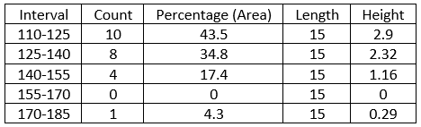
The runtimes of the 23 Marvel Movies (as of July 2020), sorted by length, are

The movie runtimes range from 112 to 181 minutes. A reasonable range for the histogram would be from 110 to 185 minutes. If there are 5 bars of equal length, each bar will be (185-110)/5 = 15 minutes long.
Here are the data divided into intervals:

Notice that there are no observations in the interval from 155 to 170.
To find the area of each bar, divide the count corresponding to a given interval by the total number of observations (23) and multiply by 100%.
For the interval 110-125: \(\small{\frac{10}{23}\times 100\% = 43.5\%}\).
The height of the interval is the percentage or area divided by the interval length. For interval 110-125: \(\small{\frac{43.5}{15} = 2.9}\).

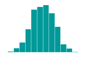
The look of a histogram depends a great deal on the number of intervals into which the data are divided. If there are too many intervals, the histogram may not provide a sufficient summary of the data. If there are too few intervals, the histgram may not convey enough information. Use the applet below to investigate how changing the number of intervals affects the data display.
The histogram shows the numbers of murders in all 50 US states and the District of Columbia.
Use the 'intervals' slider to change the number of intervals of the histogram.
The 'scale' slider adjusts the heights of the bars as needed to fit the window.
Describing Distributions
The shape of a histogram is described in terms of its peaks (modes) and tails (extreme values). A histogram with a long left tail is called left skewed. A histogram that looks the same in both tails is symmetric and a histogram that has a long right tail is right skewed. All three of the histograms shown below are unimodal, that means they have only one peak.

Left skewed
Symmetric

Right skewed
A distribution with two peaks is called bimodal and it is called multimodal if it has three or more peaks.

Unimodal

Bimodal

Mulitimodal
A smoothed histogram is a probability curve that captures the main features of a histogram. As with a histogram, area under
the curve corresponds to percentages or probabilities and the total area is 100% or 1. A smoothed histogram is easier to
sketch than a regular histogram, thus they are convenient to use to describe histograms.

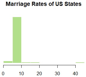
An extreme value that is much removed from the marjority of the data is called an outlier. There are various methods for determining when something is an outlier, for now, we'll look for something in the graph that is very different from the rest of the data. Look at the histogram of Marriage Rates of US States (marriages per 1,000 people in 2009). Notice that most of the states, 90% or so, had marriage rates between 5 and 10 per 1,000. There is an extreme outlier, however. One state had more than 40 marriages per 1,000 people in 2009 (incidentally, that is down from 99 marriages per 1,000 in 1990!). You'll probably not be surprised to learn that the outlier state is Nevada.
- Which distribution looks the most symmetric?
- Which distribution is left skewed?
- Which distribution is bimodal?
- Which distribution has outliers?
