- Exercise 2.131, 2.132
- Exercise 2.107, 2.109 a-d, 2.110
- Exercise 2.114, 2.116, 2.118, 2.120, 2.121
- Exercise 3.3 through 3.8, 3.9, 3.10, 3.19, 3.20
- Exercise 3.23, 3.25
Seattle (WA) 56/46
Bismarck (ND) 73/47
Richmond (VA) 83/57
Raleigh (NC) 85/60
Augusta (ME) 82/54
Tulsa (OK) 85/62
Tucson (AZ) 85/53
Anchorage (AK) 53/42
Denver (CO) 71/43
Park City (UT) 54/31
The first column indicates "forecast high", the second column is "tomorrow morning's low".
- a) Draw a scatterplot of the data, plotting the "forecast high"
on the (horizontal) x-axis and "tomorrow morning's low"
on the (vertical) y-axis.
- b) Describe the relationship you can see in the data.
- c) Calculate SS(x), SS(y), SS(xy) for these 10 data points.
- d) Determine the equation of the least squares line for
this data.
- e) Based on this equation, predict "tomorrow morning's lows"
for given "forecast highs" of 60, 70, 85.
- f) Would you use this equation to predict "tomorrow morning's low" for Nome (AK), knowing that the "forecast high" is 35? If so, which value do you get? And what is the predicted "tomorrow morning's low" according to USA Today? What happened?
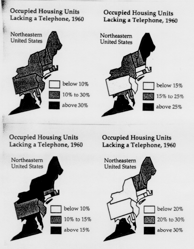
- a) (i) If you were the governor of New York, which graphic would
you use to demonstrate how advanced your state is?
(ii) If you were the governor of Connecticut, which graphic would you use to demonstrate how advanced your state is?
(iii) If you were the governor of New Jersey, which graphic would you use to demonstrate how advanced your state is?
(iv) If you were the governor of Virginia, which graphic would you use to demonstrate how far behind your state is and desperately needs federal funding?
(v) If you were a historician who wants to show how few telephones were around in 1960, which graphic would use?
- b) Now find the "true" interval for the following 5 states.
Do this by calculating the intersection of the class intervals used within
the 4 graphics above:
Maine
New York
Connecticut
New Jersey
Virginia
- c) Describe your findings from b) in one or two sentences.
- d) Now think of micromaps. Can you manipulate these as easily as these maps to express different political opinions? Explain. Describe how a micromap of this data might look like.