Try to use a computer and software of your choice whenever possible. Include printouts, screendumps, or photos of your results. Note that neither CrunchIt nor StatCrunch allow you to produce back-to-back stemplots as introduced in classe. Those have to be created by hand or by some alternative software.
- Exercise 1.41 (2 points):
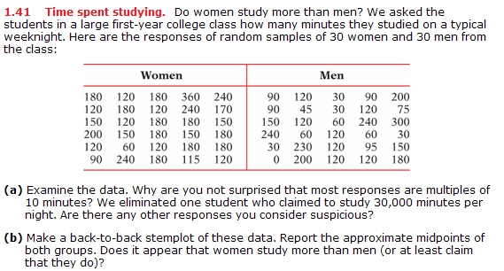
Data: http://www.math.usu.edu/~symanzik/teaching/2015_stat2000_fall/studytime.xls
- Exercise 1.43 (4 points):
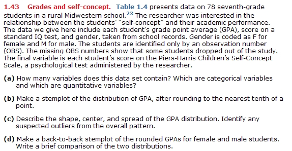
Data: http://www.math.usu.edu/~symanzik/teaching/2015_stat2000_fall/seventhgrade.xls
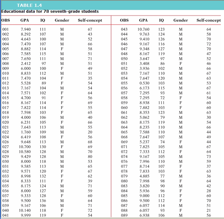
- Exercise 1.46 (2 points):
Data: http://www.math.usu.edu/~symanzik/teaching/2015_stat2000_fall/marathon.xls
- Exercise 1.68 (4 points):
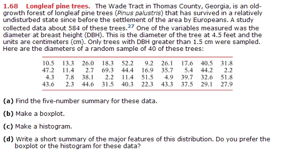
Data: http://www.math.usu.edu/~symanzik/teaching/2015_stat2000_fall/longleaf.xls
- Exercise 1.72 (2 points):

Data: http://www.math.usu.edu/~symanzik/teaching/2015_stat2000_fall/lucky.xls
The file http://www.math.usu.edu/~symanzik/teaching/2015_stat2000_fall/Yellowstone_2001_2010.csv was created from data accessible at the US National Park Service (NPS) web site at http://www.nature.nps.gov/stats/park.cfm (this URL no longer exists). This file contains the total monthly number of visitors at Yellowstone National Park (NP) over a 10-year period (i.e., 120 months) from January 2001 (MonthSeq = 1) through December 2010 (MonthSeq = 120).
Try to use a computer and software of your choice whenever possible. Include printouts, screendumps, or photos of your results.
This data file is in csv format. There exist different ways how to separate the data in such files, e.g., using commas, white space, or tabs. Here, commas are used. To load these data correctly into StatCrunch, you have to change the "Delimiter" to "comma" on the "Load data from WWW address" page.
(a) Make a histogram of the number of "Visitors" and describe the pattern and any striking deviations that you see. Create meaningful titles and labels!
(b) Make a time plot of the number of visitors and describe its pattern in terms of long-term trend and seasonal variation (if any of these is applicable).
(c) Which of these two plots is better suited to explain the number of visitors at Yellowstone NP from 2001 through 2010? Justify your answer.
The file http://www.math.usu.edu/~symanzik/teaching/2015_stat2000_fall/Survey_F2015_Population.xlsx contains our complete survey data. For this question, we are only interested in the number of Facebook friends (FBFriends).
It is your task do determine whether men from our class tend to have more Facebook friends than women (or at least, whether they may claim that they have). You should do this as follows:
- Create at least two relevant plots for each gender (four plots overall) and discuss the shape, center, and spread of the data, based on these plots. Make sure that all plots have titles, that axes are labeled, and so on.
- Create relevant numerical summaries. Justify which measure for the center (mean or median) might be better suited here.
- Discuss whether there are outliers. Do this manually, using the numerical summaries and see whether your software automatically displays outliers or whether you need to change some settings to display outliers (if any exist).
- Write a computer-based conclusive report of your results (a total of two to three pages, including all figures).