Visualizing Error with DEMs of Difference
The Basics
Differencing concurrent DEMs produces a raster with cell values representing the difference in elevation between the two surfaces. Why would different elevation models have different elevations? Because they are produced from different source material using different techniques.
In this exercise, you will compare lidar collected elevations to elevations produced from stereoscopic aerial imagery and elevations produced by the USGS, available from the National Map 3DEP program.
Part 1: Data Acquisition
To perform this challenge you will need three elevation models covering the same areal extent.
You can pull three new tiles from the UGRC or use your data from the DEM Mastery lab.
Required elevation sources:
- Lidar
- Autocorrelated stereoscopic
- USGS 3DEP
In this example we will use a set of elevation models covering Signal Peak near Monroe, Utah.

Project Overview
You will subtract one DEM from another DEM of the same extent to calculate the difference in elevation between the two elevation models.
To do this you will need DEMs of the same resolution (resampling) and for the pixels to be aligned (snapping rasters together).
Part 2: Clipping Rasters
Use the “Clip Raster” tool to cut the larger DEM tiles down to the size of your smallest tile (the lidar DEM).
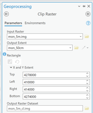
Run the Clip Raster tool twice.
Part 3: Resampling cell sizes
To do Map Algebra and subtract one DEM from another, the raster layers and their cells must be Concurrent and Orthogonal.


Image Credits: Joseph Wheaton
Resampling to a smaller cell size might seem counter-intuitive. But in this workflow, we don't want to lose the detail of the 0.5 meter lidar elevations.
Be aware that we aren't adding information by converting the 5 m and 10 m cells to 0.5 meter cells. We are just creating additional cells with the same elevation value (which increases the file size).
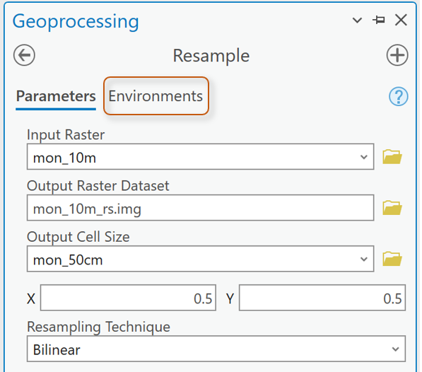
Force the cells to be Concurrent by using “Snap Raster” in the Environments settings.
Set up the Environment section to make sure the new DEM raster "snaps" to the cell alignment of the 0.5m lidar raster cells:

Repeat for the other “larger extent” DEM tile.

Part 4: Difference the DEMs
Subtract the clipped and resampled 10 meter DEM from the lidar DEM. Use the tool Raster Calculator.
The cell values of the output raster will be the differences in elevation between the two elevation surfaces.
Repeat and subtract the clipped and resampled 5m DEM from the Lidar DEM.

Part 5: Visualizing Error
Inspect the values in the two differenced output rasters.
You should expect to see a range from negative to positive values.
Which raster (the autocorrelated or the USGS) has greater differences in elevation with the lidar surface?
The best color ramp to visualize positive and negative values that increase away from a value of ‘no change’ is to use a Divergent Color ramp.

Diverging color ramps have two different colors that increase in intensity as they move away from a central ‘neutral’ color. I prefer color schemes where the middle color is truly neutral (not yellow as yellow is a warm hue and can impose bias on the visualization of the results). White and gray are good middle colors on divergent color ramps.
Choose a Divergent color scheme.
Remember that colors convey meaning. Choose deliberately.
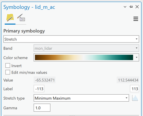
In the image above, the green cells will represent areas where the lidar surface is higher than the autocorrelated surface. The brown cells map areas where the autocorrelated cells are higher than the lidar cells.
In this example, there are cells where the lidar elevation was as much as 112.54 meters higher than the autocorrelated surface.
Set the Stretch Type to Minimum Maximum.
You will change the values in the Label boxes.
In the example above, setting the Maximum value to 113 just rounds up and ensures we will capture all the decimals with 112…
Setting the Minimum value to -113 forces the neutral middle color to align with “0” or areas of no difference.
We won’t see the darkest brown color anywhere on the map as the lowest negative value is only -65.5. We should only see light to medium brown on the map.
Repeat for the other difference raster.

Notice in this image that the higher absolute value of the minimum and maximum differences is the negative value. Round to the next negative integer (-33 in this case) and set the maximum value to correspond, forcing the middle color to align with “0.”
But Wait!
If the darkest green represents 113 meters of elevation difference on our first map, shouldn't the darkest green also represent 113 meters of elevation difference on our second map?
Why, yes it should.
So, inspect your min and max values and set BOTH min and max label values to the greatest absolute value elevation difference. In my example, the min and max labels for symbolizing both maps would be set to -113 and 113. On the second map, with less elevation difference, we would expect to only see lighter colors.
What else?...
Do we need color where there is no difference in the elevations?
No, not really.
We can force the neutral color to transparency like this:
Drop the color ramp options down and select Format Color Scheme…

Then click on the middle color’s “stop”:

Either change the color to “No color” or make the transparency of that middle color 100%.
Repeat for the second difference raster.
Now take time (sizeable amounts of time) to play around with the data.
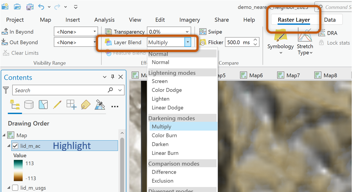
Experiment visualizing the difference rasters over hillshades calculated from the lidar, autocorrelated, and USGS DEMs individually. (Analysis tab > Raster Functions)
Remember to use the Blend Modes to maximize the visualization of the difference rasters over the hillshades.
What to Submit
Pan and Zoom around the difference maps.
Draw your own conclusion about what the results mean.
- What do the resulting min and max values signify?
- What do the different range of values tell us about the autocorrelated and USGS DEMs (when compared to lidar)?
- Why are we subtracting the autocorrelated and USGS DEMs from the lidar? Why not subtract the lidar and autocorrelated DEMs from the USGS data?
- Why did we have to resample the data? Why did we resample down to the 0.5m cell size instead of resampling everything up to the 10m cell size?
- Where on each difference raster do you see the most ‘difference’? Are they areas of slope? Valley bottoms? Ridgelines? Places with a lot of vegetation? What conclusions can you draw about the original DEM source material based on your observations?
Find the best scale, extent, and hillshade source/resolution to demonstrate your findings and conclusions about these two difference rasters. Caption each image (one showing the difference between autocorrelated and lidar data and one showing the difference between the USGS and lidar data) with a description of the data, what the colors represent (be specific), and your conclusions and observations.
Example images:

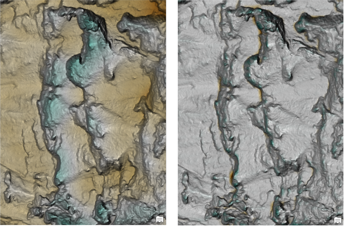
Figure 1: Left image is a 10m hillshade under difference raster showing elevation differences between the USGS elevation model and a lidar elevation model. Green cells are locations where the lidar surface was higher than the USGS surface. Brown cells map locations where the USGS surface was higher than the lidar surface. The range of elevation differences between the two elevation models was -32m to 30 meters. This means that in some places the lidar dataset had elevations 30m higher than the USGS surface and in some places the USGS dataset was 32m higher than the lidar. And then here is some information about the right hand image…
Here we are using the lidar hillshade as a basemap.