Spatial Statistics, Sasquatch Style
The Basics
In this lab you will work through some traditional spatial statistics exercises. Three levels of pattern analysis:
- Locational patterns
- Spatial auto correlation of locations and a value associated with each location
- Statistically significant clusters of locations sharing high values and significant clusters sharing low values.
You will run tools to determine the significance of the spatial patterning and distribution of the data.
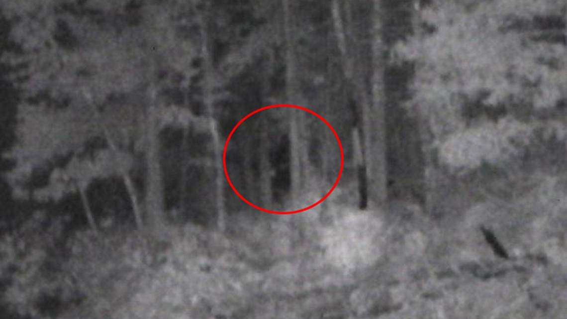
The data comes from the Bigfoot Field Researchers Organization (BFRO). We have chosen this data because it is hopefully easy to theoretically replace it with whatever subject is relative to your own work and interests. Some examples are human use of park resources, crime, bobcat sightings, traffic accidents, fish pit tag locations, etc.
Lab Objectives and Skills
- Run Nearest Neighbor tool to determine whether data is dispersed or clustered.
- Run Moran’s I test to determine strength of clusters based on associated value.
- Run Hot Spot Analysis to determine statistically significant clusters of high and low values at each location.
Note: You will be creating a lot of new data layers in this lab. We recommend being VERY aware of your naming conventions and placement of output files. Take notes or whatever is necessary so you know what is what and where.
Data
- Bigfoot_pts.shp (BFRO.org)
- NorthAmerica.shp (DIVA-GIS.org)
- US_county_population (U.S. Census Bureau)
Getting Started
- Develop your questions:
- Do Bigfoot sightings occur randomly across the US?
- Are sighting locations evenly dispersed on the landscape?
- Explore data:
- Add the Bigfoot_pts dataset to a blank ArcMap/Pro document.
- Inspect the attributes:
- The “Class” field (fabricated for the purposes of the lab) contains ranked numeric values that correspond to the reliability of the sighting.
- 5 = highly reliable (i.e. credible or multiple witnesses, low probability of misinterpretation, etc.)
- 1 = the lowest level of reliability (i.e. third hand reports, untraceable sources, poor lighting, etc.)
- Symbolize the data categorically by Class.
- Check out the data properties (coordinate system, etc.)

Nearest Neighbor Tool
- Search for and open the Average Nearest Neighbor tool.
- Check the box to Generate a Report.
- Run tool
ArcGIS Pro Example:

- Open the results window
- ArcMap: Geoprocessing drop down > Results > Current Session
ArcMap Example:


- ArcGIS Pro: Open History from Analysis Tab on Ribbon > Right click your tool > Left click View Details > Left click the .html link
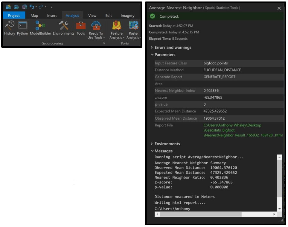


- The five returned values are provided in the results window.
- Expand the Average Nearest Neighbor section.
- Double click on the html report to open a graphic version of the results:

The data distribution is clustered if the Ratio value is less than 1.
The ratio is calculated from the observed mean distance from each point to its nearest neighbor and the mean distance between a theoretical set of randomly distributed points within the same area.
- Interpret your results.
- Was your mean distance less than the expected distance for a randomly dispersed dataset?
- What does the nearest neighbor ratio tell you about your data?
- Is your data randomly distributed or does it exhibit clustering?
You’re going to need this information for your final submission, so make a note of these:
- Expected Mean Distance and Observed Mean Distance (with units!)
- What these values mean in your own words,
- The Nearest Neighbor Ratio, and
- What the NNR tells you about your data (all in your own words).
Note: There are drawbacks to using Nearest Neighbor Distance to analyze point patterns. The tool calculates distance to the nearest neighbor. So it’s a very localized method and ignores larger patterns. It may miss clustering patterns altogether.
A second note: There is an improvement on this called the Ripley’s K Function which allows for using the mean distance of the nearest “k” neighbors. The user sets Distance Bands within which to calculate nearest neighbor means. In ArcGIS this tool is called Multi-Distance Spatial Cluster Analysis (Ripley's K Function).
Spatial Auto-Correlation with Moran’s I test
This test allows us to determine if there is any statistical significance to the amount of clustering.
- Open the Global Moran’s I tool.
- This tool measures autocorrelation of both the spatial location and an attribute value. So in this case, we will use our Class field (reliability of sighting).
- Add your Bigfoot points and use the Class field, leave the rest of the inputs as they are.
- Again, no output shapefile is created, instead the results are written to the results panel in the geoprocessing drop down menu.
- In this tool, the Class attribute is used to calculate the standard deviation for the whole set, then deviations of neighboring points (defined by the variable distance band computed for each dataset) are multiplied. See Esri’s help page for more info:
- How Spatial Autocorrelation Works
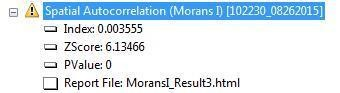
- Open report, interpret the results:
- What is your data’s Moran’s Index?
- Does yours exceed that range?
- The Index value should be between -1.0 and 1.0.
-
- The most common problems are the following:
- The Input Field is strongly skewed (create a histogram of the data values to see this), and the Conceptualization of Spatial Relationships or Distance Band is such that some features have very few neighbors. The Global Moran's I statistic is asymptotically normal, which means for skewed data, you will want each feature to have at least eight neighbors. The default value computed for the Distance Band or Threshold Distance parameter ensures that every feature has at least one neighbor, but this may not be sufficient, especially when values in the Input Field are strongly skewed.n Inverse Distance Conceptualization of Spatial Relationships is used, and the inverted distances are very small.
- Row standardization is not selected, but should be. Whenever your data has been aggregated, unless the aggregation scheme relates directly to the field you are analyzing, you should select row standardization. (From the ArcGIS Resource Center)
- The most common problems are the following:
- Rerun the tool, but...
- Change the Conceptualization of Spatial Relationships to Fixed Distance Band (Why? Read above), and
- Set the Distance to 1,000,000 (1000 km).
- We are trying to make sure each sighting has at least 8 neighbors.
- Evaluate results What is your Moran’s I value this time?
Without turning this into a statistics course, we do want to demonstrate that at the very least we have ways to qualitatively demonstrate that our data is not randomly dispersed.
To create a better visualization of how some of these inputs impact the actual results, let’s run a hot spot analysis on the sighting points.
Hot Spot Analysis
This is another tool that utilizes the attribute values in addition to the spatial location.
- Search for and open the Hot Spot Analysis (Getis-Ord Gi*) tool.
- Set up the tool parameters.
- Change the Conceptualization of Spatial Relationships to Inverse Distance. (Why change that?)
- This tool DOES produce an output feature class. Name your outputs carefully. We called ours sasq_hotspot_ID.shp (ID for inverse distance)
- Don’t input a Distance Band. Let Arc calculate if for you.
- Run tool
- Open the results window.
- Notice the exclamation points.
- Expand the Messages section.
- Note the warnings.
The first tells us the distance band calculated for your data was 1,477,931 meters. Click on the blue warning hyperlink to read that this is the minimum distance to ensure every point has at least one neighbor to evaluate against.
The second warning tells us that at least some of the points have more than 1000 neighbors within that distance band and that we might want to rethink our spatial relationships. I don’t think this is a problem unless you are working with a dataset that literally bogs down your system.
The third warning just gives more info about the points that have more than 1000 neighbors in the distance band.

Visually evaluate the results. This looks pretty logical on the continental scale, yes? Zoom into a specific area (eg. the PacNW or Florida).
Run the tool again, but leave the Conceptualization of Spatial Relationships as Fixed Distance and use approximately the same distance band that was calculated in the Inverse Distance run.
(See the Core Concepts page on Fixed Distance selection for more information.)
Open the results window to evaluate. The results window shows the same warnings. The visual results are quite different:


What happened to the two areas of high authenticity (and apparent spatial autocorrelation of reliability value) marked in the image on the left? There is now a hot spot between Texas and Louisiana that wasn’t visually apparent on the raw data.
This tool runs so quickly, we tested the Distance Band (Threshold Distance) by dropping it to first 500,000 meters and then 100,000 meters. The 100,000 meter distance band gave the following results.
Within our 100 km neighborhood, the blue point locations are statistically significant clusters of low reliability sightings. The red areas are statistically significant clusters of “highly reliable” sightings.
Run Hotspot analysis and choose your own fixed distance band (less than 1500 km) and present the resulting map (with fixed distance reported in caption) on your website.
Moving On
Ok, so we have done a pretty decent job of exploring the spatial distribution of the data. It is clear that the sightings are not randomly distributed across the country and are indeed clustered.
The Nearest Neighbor analysis is probably the most applicable to our analysis as the “reliability” value isn’t a terribly useful attribute value. The classes are somewhat arbitrary and subjective. There isn’t any reason to think that sighting locations with high reliability should have neighboring sighting locations that were also highly reliable. That is, unless, there really are Bigfoot in those locations who tend to make themselves unequivocally noticed…
The concept of spatial autocorrelation is perhaps more applicable to natural phenomena such as elevation or soil acidity; phenomena with values that transition somewhat smoothly in space. But then again, demographic distributions like household income, crime, education, age can be very sporadically spatially distributed and autocorrelation tools are often used to describe and identify hot spots and other spatial patterns.