Data Mining & Professional Cartography
Mapping our changing climate
Basics
The focus of the exercise is to further explore the importance of accurate display techniques and communication of technical and complex data to a general audience. You will create a professional map or figure comparing temperature change maps for two different periods of time relative to a baseline period.
You will download synthesized global climate data from NASA /Goddard Institute for Space Studies’ Surface Temperature Analysis site.
The main challenge of this exercise is to wrangle the data values, symbolize them accurately, and communicate their meaning clearly.
When preparing a map to present information, the map maker must make choices about what information to include or leave off the map in order to best support the map’s purpose.
This tutorial was originally conceived by Dr. Peter Howe at Utah State University.
Data
- Climate data downloaded from NASA Goddard Institute for Space Studies
- Continental boundaries downloaded from ArcGIS Online
NetCDF Files
You will be working with global temperature data in this lab. Many organizations are making global temperature, precipitation, atmospheric pressure, and wind data available for scientists and the public to access, visualize, and analyze.
The format of the data is NetCDF, short for Network Common Data Format. This is a type of raster file that allows you to include multiple raster layers in the same file. It is used in the fields of meteorology and climatology to display large sets of weather and climate data at different points in time. NetCDF files are an open source file format that have metadata embedded in the file, which makes them easy to share and use on different computers with different software packages.
Download Data
- Go to the NASA GISS website (Google NASA GISS).
- You are looking for Global Maps of Surface Temperatures
- Navigate to Datasets > Surface Temperature (the upper left portion of their home page)
- Navigate to Global Maps (link on the right hand side)
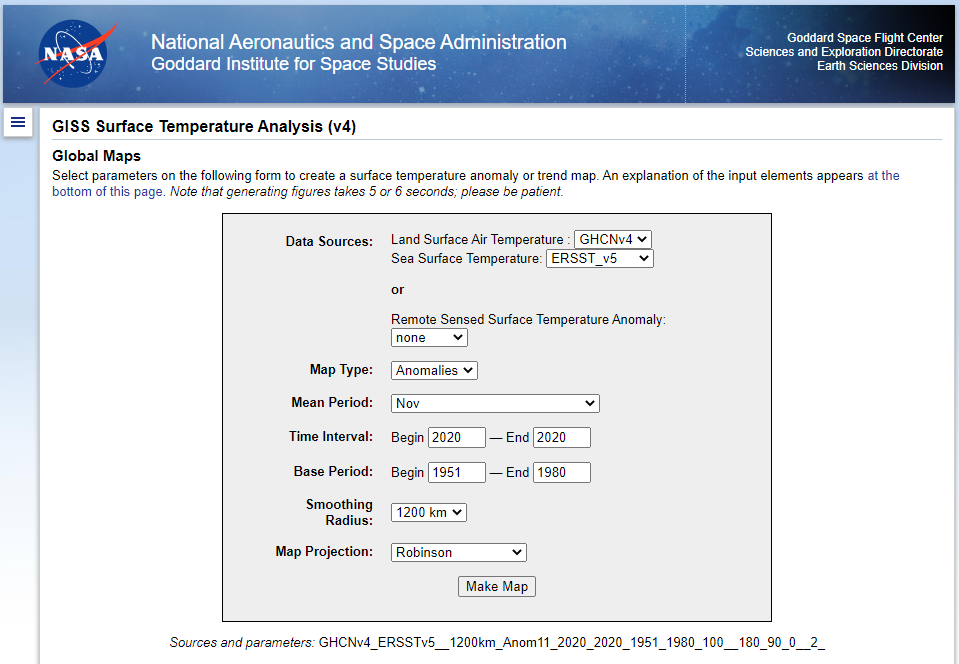
You are looking for this form
Set-up the Form
You will produce at least two datasets. Each will display a calculation of global temperature change between two periods of time.
Use the same base period for each calculation. For example, you might show the change in surface temperatures from the 1900s to the the 1980s and then in a second map how global temperatures have changed between the 1900s and the 2010s.
- Map type = Anomalies
- This calculates the difference in mean temp between the two time periods you will input
- Mean Period = You decide, but you must include the mean period you choose on your map
- This filters the part of the year over which the temperatures are averaged
- You can choose a summer month, a winter month, a calendar year or meteorological year or season.
- Time Interval = You decide, you will set up this form twice
- Base Period = You decide, but keep it the same between your two runs of the model.
- Smoothing Radius = Use the default
- Map Projection = Use the default
Press Make Map
Video demonstration and discussion of the data mining options:
The map will show temperature differences between a baseline period and a more current period of time.
You are mapping the difference in temperature (the change) not temperature.
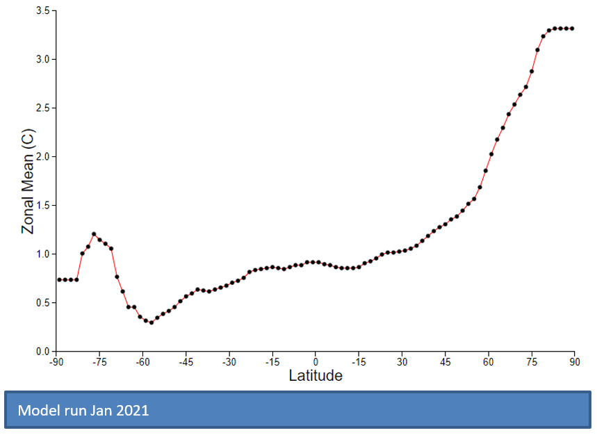
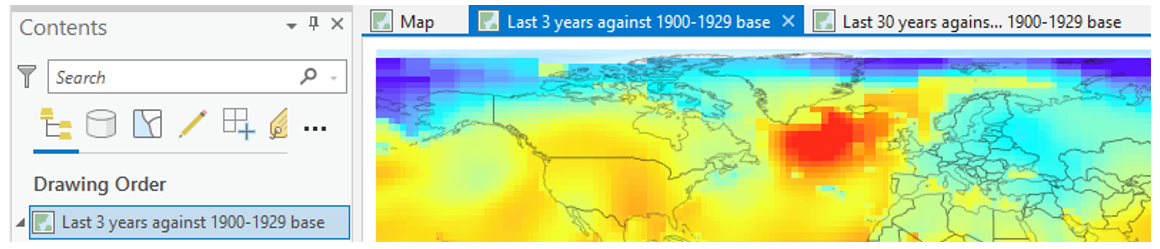
Model Run June 2022
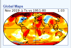
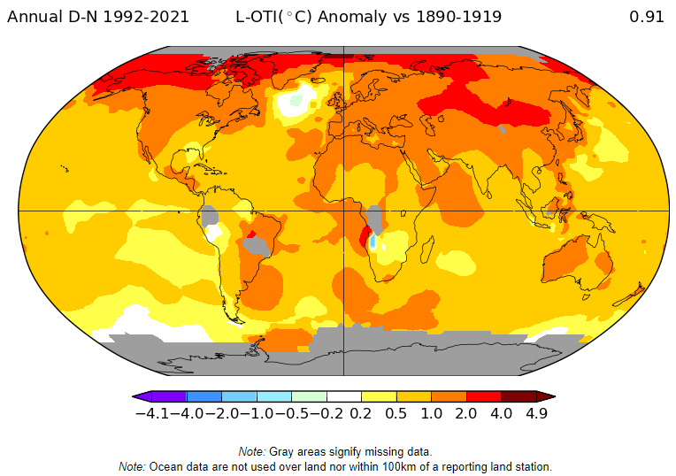
The number in the upper right (0.91 C in the example) is the calculated global mean temperature (increase in this case) between the mean periods; the difference (degrees C) between the global mean of the earlier time period and the global mean of the later time period. Globally, there has been a 0.91 C increase in mean annual temperature between the average temperature for the 30 year period 1890-1919 and the 30 year period 1992-2021.
The model also produces a graph. You can see that the largest increases in temperature occur in the northern latitudes. At around 60 degrees latitude in the southern hemisphere, there is a region showing very little change.
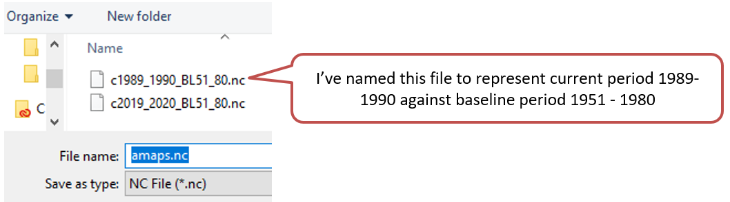
Download Data for later use
- Left click netCDF at the bottom of the page.
- Save the file to a deliberate location.
- The file will have a generic name: nmaps.
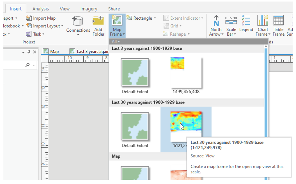
Adding NetCDF files to ArcGIS Pro
NetCDF files cannot be added to ArcGIS Pro using the Add Data button like you can with other data. The NetCDF file must first be converted to raster format.
Open the tool Make NetCDF Raster Layer

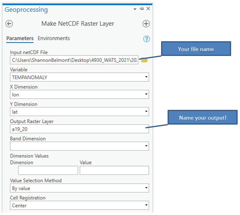
Set up the tool as seen above with your file names and run.
Another way to add NetCDF data is to use the “Add Multidimensional Raster Layer” option in the Add Data drop down.
Here's how:

Set up the Add Multidimensional Raster Layer window like above.
This is continuous raster data. Nearest Neighbor is not an appropriate interpolation method.
Change to Bilinear.
Repeat with your second netcdf file to add both datasets to the contents pane.
Download Country Boundaries from ArcGIS Online
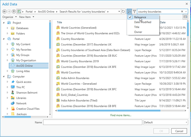
Notice you can sort the results by relevance (mine defaults to “date modified” which I don’t find very helpful).
Change the symbology so that the polygons aren’t filled and the line is unobtrusive.
Acquaint yourself with these new datasets
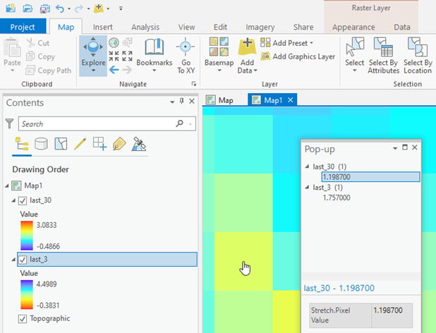
First – look at the range of values in the table of contents for each layer. What are the min and max values? What are the units of measure? What do these values mean? You really need to know this to make effective maps.
Zoom in until you can see individual cells. Use the Explore tool to sample the cell values.
Should positive values be displayed with warm colors or cool colors?
Open the Properties for the new raster layer > Source tab
- The Spatial Reference (coordinate system) is listed as WGS 84. This is a geographic coordinate system (GCS).
- It is a floating point raster. This means that the cell values can contain decimals. This also means it won’t have an attribute table. (Each row is a unique value. Floating point could have an infinite number of rows... The table would be too big.)
- The default units are degrees (think lat/lon). The cell size is 2,2. This means each cell of the raster spans 2 degrees by 2 degrees.
Evaluate the spatial distribution of the temperature changes across the map
Why? Because that’s what GIS experts do.
What is the map telling you about change in global surface temperatures over time (how are the values spatially distributed)? (Your map will look different depending on which periods of time you are comparing, of course.)
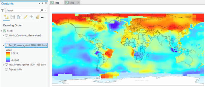
In my map, there is an area in the north that seems to be experiencing a high increase in average annual temperatures relative to the base period (1900-1929) but the rest of the map seems to suggest cooling across most latitudes with exceptions in Brazil and near the Antarctic Peninsula.
Does that jive with what we know about increasing global temperatures? The draft map created on the GISS website for these time periods showed consistent warming and a global average increase of 0.9 degrees Celsius:
What is the range in values for your anomaly layer?
My experimental run produced the following:
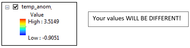
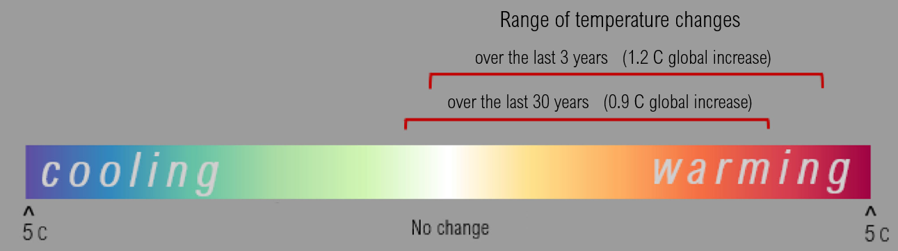
The color ramp goes from cool to warm colors (blue to red), but the range of values is most likely not centered evenly around 0 degrees. (Depending on your time periods, you may not have any negative values at all.) Additionally, the color scheme appears to be dominated by cool colors. Notice how the yellow is well above the midpoint. Much of the ‘warming’ temps are displayed with cool colors (greens and blues).
That creates a misleading visualization of the change in temperature values as we tend to associate yellows oranges and reds with warmth and greens, blues, and purples as cool colors.
Wrangling the Symbology
While there is a lot of room for uniqueness and individuality in cartography, there are some visualization rules that must be followed.
With this data, those rules include:
- There must be a neutral color that represents directionality from a meaningful midpoint. In our case “0” temperature change between the two periods of time.
- Intuitive colors must be used to represent warming and cooling.
- The symbology on the two maps must be united. If “dark red” equals 2 degrees C increase in temperature on one map, the same shade of red must represent 2 degrees C warming on the second map. In other words, apply the same range of values to both color schemes.
You need to present these temperature change values in an intuitive and accurate manner.
Use a diverging color scheme with warm and cool colors ensuring the “0” value (no modeled temp change between time periods) is set to the neutral color.
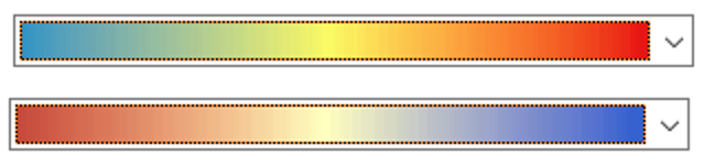
Be aware of the "Neutral" color. If it is a 'warm' color, then you are imparting bias by displaying areas with no change in temperature as areas that apprear to have a slight warning trend over time. Both examples above have a yellow mid-color on which the 'no change' values will pivot. That will make your map look warmer than it.
Matching color schemes
I'm going to use these maps to walk through the symbology work:
With the crazy distribution of positive and negative values, this is most easily done by altering the symbology’s min and max value to be equal opposites, to ensure 0 is in the “middle” of the value distribution.
Open the symbology of the new random raster.
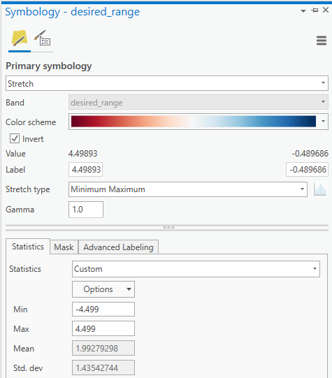
Set up the parameters:
- Primary Symbology = Stretch
- Color Scheme – choose a divergent color ramp, one with a neutral mid-color.
- Inspect the values to determine if your colors need to be inverted
- Warm colors are positive value, negative values and cool colors
- Label boxes: Round and include units (C ).
- Change Stretch Type to Minimum Maximum
In the Statistics tab:
- Change the Statistics option to Custom
- Replace the Min and Max values with the rounded ‘greatest absolute’ value.
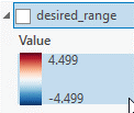
In my example, 4.49893 was the greatest absolute value. I rounded the value to slightly above in order to include that value. Then entered the corresponding opposite (-4.499) in the minimum box.
Import symbology to each raster layer
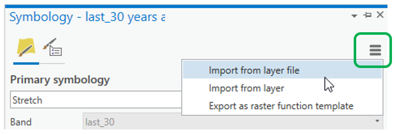
Note: you might need to toggle the statistics to Custom
Evaluate the resulting symbology
- You should be able to detect a visible trend between the two time periods given what we know about global climate warming.
- Use the Explorer tool to sample locations to determine that positive temperature change values are drawing with warm colors and negative with cool colors.
Save Raster Symbology
These rasters are temporary layers. You should make them permanent so you can work with them later without having to recreate them from the netcdf files. At the same time, we will save the symbology work you have done.
- Export Rasters: Right click in contents pane > Data > Export Raster.
- Save Symbology: Right click in contents pane > Sharing > Save as layer file.
Save the symbology of both new raster layers.
Now it’s all about making a professional presentation.
Map Layout

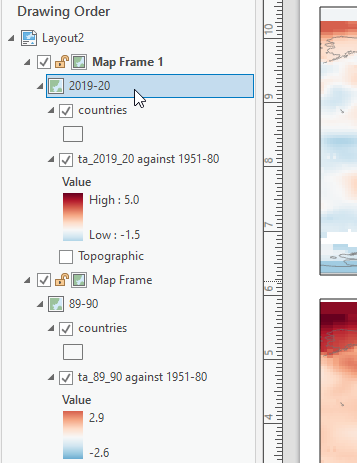
In ArcGIS Pro you will need a Map for each Raster Layer.
- Insert > New Map
Add one of your saved anomaly raster layer files to each map.
Rename the maps to reflect the different time periods.
Insert New Layout to create the digital page the maps will be set up on.
Insert Map Frame > Choose one of your maps > Draw a space on the layout
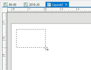
Repeat to draw a space for the second map
Change the display coordinate system for the map frames to get a more natural look:
- Table of Contents > right click on the MAP title (not the map frame or raster layer) > Properties > Coordinate system tab
- Use a Projected World coordinate system. I fancy the Natural Earth projections.
Legends
You can insert legends from the Insert tab.
Draw a space for it on the page like you did with the map frames.
Legend formatting takes a lot of work in ArcGIS. I’d recommend building a legend in some user friendly graphics software.
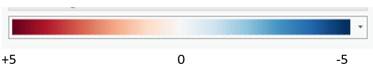
This is one legend I built in PowerPoint:
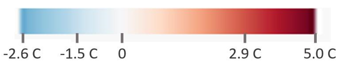
Why PowerPoint? Because it would take 2 months to do this in ArcGIS. You can also use a free graphics website called “Canva.” Canva and PowerPoint are user friendly and efficient for simple graphic manipulations (resizing, rotating, adding marks and text).

Here’s how you might proceed.
- Take a screengrab of the color bar in the contents pane of ArcPro.
- Or for better results, insert a legend and expand the color bar first to conserve the quality (I’ve got a video demonstrating this) and/or export the layout to something high resolution to add to PowerPoint or Canvas.
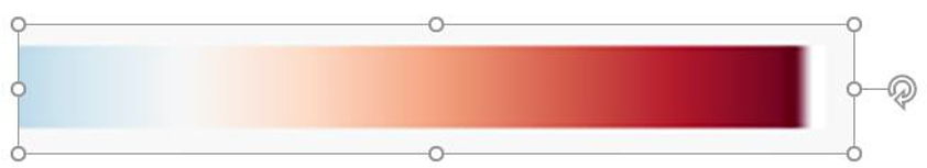
- Paste it into a PowerPoint slide and enlarge it and crop it so you have one clean image of the color bar.
- You might have a balanced color bar (dark red to dark blue instead of light blue like above). That’s fine. You decide how you want to present your values.
- Add text boxes to label the bar with your minimum and maximum temperature change values and zero.
- Add tick marks and units of measure for the values
- Enlarge the final product, screen-grab it or export/save the image as a png file. In ArcGIS Pro, used the insert picture option to put the new legend on your map.
There are many ways you can approach the legend for a map like this.
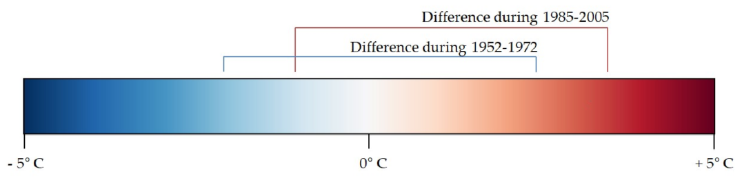
Here are some examples:
![]()