Spotted Owl Habitat Modeling
This exercise was adapted from original instructions written by Christopher McGinty for USU's Applied Avian Ecology Lab.
The objective of this lab is to demonstrate the use of a geographic information system for basic habitat modeling. This exercise will walk you through the process of using Esri ArcGIS Pro to create a composite binary raster model of potential habitat for Mexican spotted owls.
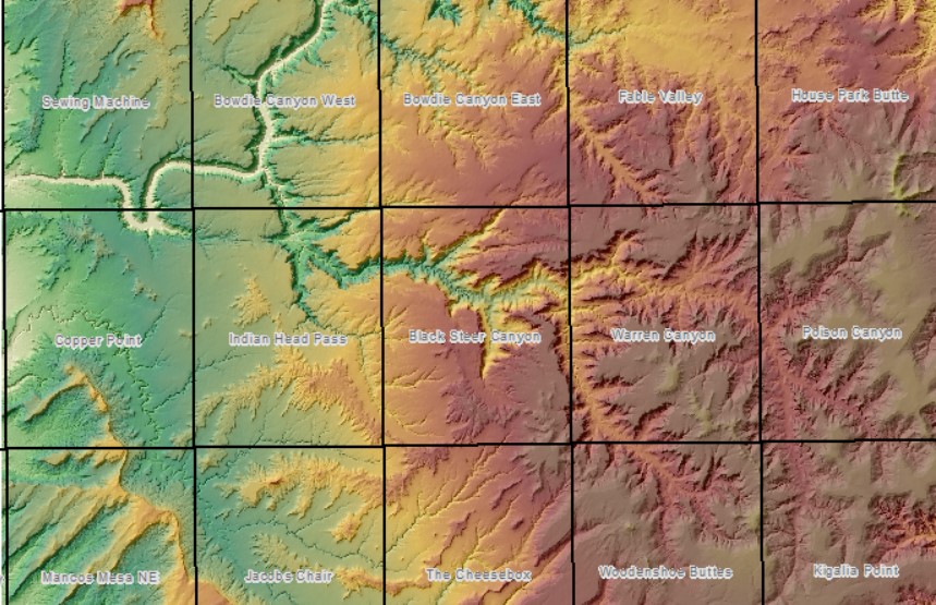
Our study area for this analysis covers the USGS 7.5 minute quadrangles known as Indian Head Pass, Black Steer Canyon, and Warren Canyon in southeastern Utah.
Data available on Canvas
Data Credits:
- Digital Elevation Model source: USGS National Map (usgs10m_dem)
- Existing Vegetation Type source: Landfire.gov (landfire_evt)
Overview of the analysis steps
-
Create the following layers from the DEM (use the spatial analyst toolbox):
Make sure you fully evaluate your results.
Know what the units of measure are.
Check range of values to ensure they are logical for the units. - Reclassify the rasters using the criteria in Table 1
- Suitable
- Unsuitable
- Run Raster Calculator to add the input raster layers together
- Evaluate results
- Quantify the suitable areas
- Complete the Challenge on Canvas
In order to build a predictive habitat model about a particular species, it is imperative to know and understand the habitat variables in which a species lives and forages. There are many statistical methods for determining the most appropriate variables for building a habitat model (i.e. Logistic Regression). In this case, we have consulted researchers and identified four model variables for modeling the Mexican Spotted Owl habitat.
Look at the following table. The GIS dataset called “landcover” was created using remotely sensed imagery. We will use this variable in the model to identify vegetation types the owl prefers. Other datasets that we have identified as critical are slope, concavity/convexity, and aspect, each of which will be derived from a digital elevation model (DEM).
| General Model Criteria | GIS Data Variable | Refined Model Criteria |
|---|---|---|
| Vegetation Communities with Trees | Landcover | Pinyon-juniper communities |
| Steep Canyons | Slope | Slopes greater than 40° |
| Ledges & Caves | Concavity/Convexity | Curvature values greater than 1.5 SD from mean |
| Northerly Aspects | Aspect | North West, North, and North East aspects |
For an overview of raster modeling, check out this video:
Step 1: Prepare data layers for habitat model
Create a slope layer from the DEM
- Use the Spatial Analyst Slope tool
- Parameters:
- Input Raster = Slope is calculated from elevation values
- Name your output.
- Remember, there is a 13 character limit for raster file names
- No spaces (underscores are ok)
- Units = Look at the habitat criteria
- Method = Planar or Geodesic shouldn't impact the results at this scale. If you choose planar, ensure you use the proper coordinate system for this location.
- NAD 1983 UTM Zone 12N
- Z factor = 1 (default)
Run
Examine the slope results (always evaluate your resulting output)
- Is the value range reasonable for slopes in the units you chose?
- Use the Appearance tab in ArcGIS Pro to increase the transparency of the slope layer over the hillshade and/or blend the layer with hillshade to evaluate the results.


Create a curvature surface
Curvature is a measure of how the slope slopes within a raster cell. Is the cell's slope concave or convex?
Curvature is calculated from elevation values and can be calculated in both the planform (across slope) and profile (down slope) directions.
- Use the search window to locate a tool that will generate a concavity/convexity surface. Using the keyword “curvature”, you should locate a tool called Curvature (Spatial Analyst). As before, we need to supply the proper parameters for the tool to operate:
- Input raster = curvature is calculated from elevation values
- Name your output.
- Z factor = 1 (default)
- Output profile curve raster (optional) – leave blank
- Output plan curve raster (optional) – leave blank
Run
Visualize the data meaningfully to evaluate results
- The range of values is distributed and divergent around 0.
- Use a divergent color ramp - this is a color scheme with a middle neutral color and two colors that increase in intensity as they move away from the neutral color.
- Display the curvature semi-transparently or blended over hillshade to help visualize the positive and negative values.
- Zoom in to detect the topographic patterns
- Notice the green cells in the image below are showing the ridges or convex locations, the pink cells are mapping concave locations.
- Owls prefer concave surfaces.
- Are concave surfaces positive or negative curvature values?
We will use these curvature values later in the habitat model.

Create an Aspect raster
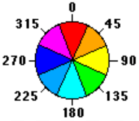
Aspect calculates the cardinal direction the slope is facing
While aspect describes the direction the slope is facing, you don't run Aspect using the slope layer as input. Aspect is calculated directly from elevation values.
ArcGIS applies a default classification system and color scheme to the output to help with evaluation.

Create a hillshade layer from the DEM
- Learn more about hillshade layers
- Analysis tab > Tools - to open the geoprocessing window
- Use the Spatial Analyst Hillshade tool
Why hillshade? Because it will give you an effective layer against which to evaluate your output layers as you work.
Evaluate results over hillshade
Use the explore tool to sample aspect cell values on the landscape and make sure the numeric values make sense.

Step 2: Prepare raster layers for the composite GIS model: Reclassify
Look back to Table 1 and recall the model variables.
In this step you will reclassify the existing rasters into binary (0/1) datasets based on the model criteria in table 1.
- Curvature: Concavity greater than and less than 1.5 standard deviations from mean
- Aspect: NW, N, and NE aspects
- Landcover: Pinyon-juniper woodland
- Slope: Slopes greater than 40 degrees
Reclassify the Curvature raster layer
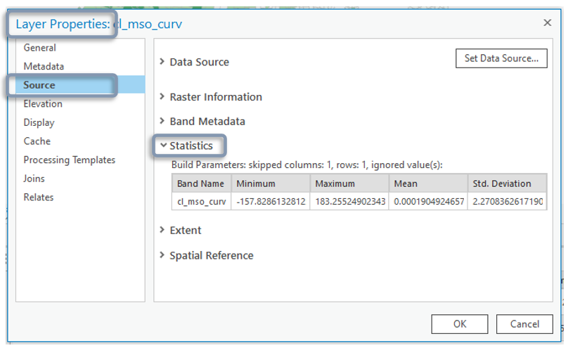
To reclassify the curvature dataset, first we need to calculate 1.5 standard deviations from the mean. We can find the summary statistics (mean, StDev, etc.) in the Symbology properties for the raster. (Note: summary stats for rasters can also be found in the raster layer's properties > Source > Statistics. Often, the symbology histogram rounds the values. If you want more precision, it is found in the layer's properties.) These values will not match yours.
- Open the symbology for the curvature raster
- Change the primary symbology to Classify
- Click on the Histogram tab
- Drop down the "More" menu and select 'show statistics'
- Write down the mean and standard deviation for the curvature raster.
- Calculate 1.5 times the standard deviation and make note of that value.

Previous statistical analyses have determined that concave values greater than 1.5 times the standard deviation are suitable for the Mexican Spotted Owl.
Use the map. If you didn't earlier, display the curvature values with a divergent color ramp over the hillshade.
Create two groups of raster values - one representing the high concavity values and one representing lower concavity, linear and convex values.
Assign binary (true/false) values to replace the full range of curvature values using the "Reclassify" tool.
- One group contains values from the minimum to the mean - (1.5 x StDev) = suitable or "1"
- One class containing values from the mean - (1.5 x StDev) to the maximum value = unsuitable or "0"
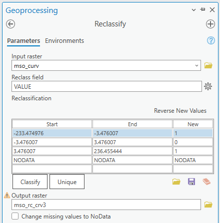
- Search for and open the Reclassify tool. The reclassify function replaces existing raster cell values with new values.
- Set up tool parameters:
- Input raster = usgs10m_crv
- Reclass field = Value
- Press the classify button
2 classes - Fill out the form with the break values you calculated from the standard deviation and mean.
- Edit the New Values to reflect 1 for suitable curvature and 0 for unsuitable curvature.
- Output = "rcls_curve"
- Evaluate results
- There should be only 2 values in the output: 0,1
- The areas mapped "1" should align with the high concavity areas in the original dataset.
Your values will not match these exactly.

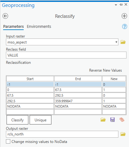
Reclassify the Aspect raster
Note that aspect, in this form, is a cyclic variable. The slope directions are measured by azimuthal direction (i.e. 0-360 degrees), much like a compass. This is important as it means there will be two ranges for the NORTH direction (separated by -1 values for flat cells). Recall:
- Suitable aspect values (New Value = 1):
- North (aspect values 0-22.5)
- Northeast (aspect values 22.5-67.5)
- Northwest (aspect values 292.5-337.5)
- North (aspect values 337.5-360)
- All other values are unsuitable.
- All other values are unsuitable.
- Inspect the values in the Contents pane.
- Name the output: rcls_aspect
- Evaluate results and verify the output contains only two values: 0,1

Cleaning up straggler values
You might run Reclassify and find that not all values were tucked neatly into one of your new output classes.
To fix this, run Reclassify again, but on the reclassified output and assign the straggler value its appropriate value.
Reclassify the Slope raster
Remember to use the 'classify' button to set the number of classes.
Mexican Spotted Owls prefer slopes > 40 degrees.
This should be a breeze.

Reclassify the final layer, the Landcover raster
This is a different type of raster. The values are numeric representations of categorical data (names of vegetation and land cover types).
The suitable landcover type is “Pinyon-Juniper Woodland.” Determine the value which represents pinyon-juniper woodland and assign a new value of 1; all other landcover types will be assigned the value of 0.
In ArcGIS Pro, the classification window reads the descriptive fields. Cool to know. And helpful.
In the Reclassify tool, set the reclass field to EVT_GP_N (existing vegetation type, group name) and methodically go through and assign all non-pinyon juniper group types to "0" and the two suitable group types to "1". JUST KIDDING.
While brute force effort is sometimes the best way to go, there is always another way to tackle tasks in ArcGIS. Let's find a better way.
- To complete this reclassification, you need to open the ATTRIBUTE Table for the landcover raster and discover the "suitable" landcovers.
- Search the table for landcovers associated with Colorado Plateau Pinyon-Juniper Woodland
- Make note of this VALUE.
- Search the list for the VALUE associated with Great Basin Pinyon-Juniper Woodland
- Make note of this value.
- Search the table for landcovers associated with Colorado Plateau Pinyon-Juniper Woodland
- Reclassify the landcover_evt raster to preserve both Pinyon-Juniper Woodland landcover types as suitable (1), and all other values as unsuitable (0).
- Make note of the min value and max value. Think through the classes you will need.
Step 3: Creating the composite GIS model - Raster Calculator
ArcGIS provides the ability for analysts to perform mathematical calculations on rasters. This is often referred to as map algebra or raster math. The Spatial Analyst toolbox contains many different raster math functions that may be used to manipulate and analyze the data.
When combining multiple rasters, is it crucial to align the cells of the individual raster. This means ensuring the cell sizes are the same (ours are all 10 meter cells), and that the cell corners are aligned (orthogonal and concurrent).
Demonstration of raster concurrency:
The landcover and DEM layers were prepared ahead of time to make sure that all outputs are concurrent.
In this step you will use the Raster Calculator to add the 4 input layers. The Raster Calculator builds and executes a single map algebra expression on one or many grids. It is possible to build complex equations using the calculator.
- Search for and open the Raster Calculator (Spatial Analyst)
- Create an equation adding the 4 binary rasters together
- Double click to add rasters and operators to the equation pane
- Name your output
- Create an equation adding the 4 binary rasters together
- Evaluate results
- Visualize the results
- Change the colors - to build in intensity as the values increase.
What do the output values mean?
Which value represents suitable habitat for the spotted owl?

The symbology in this image has been customized to show 0 values as red and most suitable cells with values of 4 as green. The model output is draped over the hillshade.
Green tends to be read as safe, healthy, fresh, "grassy," or agreeable in some way... which is how it might be applied in this map.
The cartographer should at least think about color choice and, when possible, ask for feedback to ensure their maps are telling their intended story.
Step 4: Quantifying suitable areas
- Calculate the total area mapped as suitable within the study area polygon.
- Add the study area polygon to the map
- Cut the habitat model raster with the study area polygon by using the tool Extract by Mask (or "Clip" in the Data Management toolbox)
- Multiply the Count of suitable cells by the Area of one cell.
A way to normalize the resulting areas is to compare the proportion each suitability class is to the whole area of interest.
What proportion of the area of interest is "suitable" and what proportion is "highly suitable"? for example...
To calculate this you don't even need the areas, just the cell counts from the clipped habitat model raster.
Sum the Cell Counts to get the total number of cells in the area of interest
Divide each suitability class's cell count into the total number of cells to get the proportion of each suitability class to the whole.
(The proportions should add to 1.)
If you want, multiply by 100 to get the percent total.
Report the proportion or percent total for each suitability class along with your final submission.

The map above ArcGIS map is displaying only the values of 3 and 4 with lesser values assigned 'no color'.
Considerations
How could you improve the symbology of this map? Think color, transparency, blending.
What kind of spatial context is helpful for a predictive habitat map for spotted owls in Utah?
What landmarks or features would help your audience understand your results and relate them to owls and/or trust and know that your results are reasonable and logical?
At what scale are you choosing to display your results? Are you giving your reader the big picture? Details on the ground? Does the relevant spatial context change depending on the scale?
How can you provide the most information about the model process and the environmental predictors without bogging the map down with paragraphs of text?
These are just a few of the cartographic considerations you need to think about.