Introduction to ArcGIS Pro
This lab will walk you through the process of adding spatial data to an ArcGIS project and symbolizing the data in meaningful ways.
We will discuss two formal map elements (titles and supportive text) and learn how to insert them into your map. Cartography is a topic we will revisit every week as it is a crucial skill when communicating results of your GIS research and analysis.
Setting up
Create a Workplace Folder: Why?
Good GIS Work

Whether on your desktop or external drive (or some other place you deliberately choose), create a folder specifically for this course and then inside that, a folder for this exercise.

Download the data from Canvas
Here’s how:
Go to the assignment page on Canvas, and click on the Data hyperlink to download the data for this lab.
This is a zipped file. You have to unzip it before you can use it. Different systems have different zipping software. These instructions may not suit everyone.
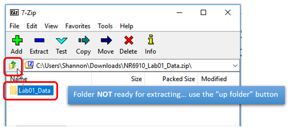
At the bottom of your browser window, track the progress of the download. When it is complete, double click on it to open the 7zip extractor window:
In the 7-Zip window - use the “up a folder” button (below) get the folder with the “Z” on it in the main window.
appear

Save the unzipped data to your workplace folder.
Data
The data folder contains the following maps (listed here with their sources)
- 50m_rivers_USA (NaturalEarthData.com)
- Ecoregions (epa.gov)
- State_capitals (NationalAtlas.gov)
- State_US (Mapcruzin.com)
- USA_roads (NationalAtlas.gov)
- USA_dem (USGS.gov)
- USA_dem_hs
Here are some strategies for success:
- Always create a (local) workplace folder (i.e. not on Box or Drive) (you can upload to those at the end of your work session)
- When you download and unzip the data from Canvas, save the data folder to your workplace folder before starting ArcGIS Pro (or adding data to your project)
- Make sure all data created or added during your work session is saved to your workplace folder
- Name files and folders meaningfully – remember, no spaces!
All labs are written for ArcGIS Pro.
Open ArcGIS Pro
- Open the Windows Start up menu
- Click on ArcGIS tab (or search ArcGIS)
- Find ArcGIS Pro tab and open it
- Open a blank project
- Name your project (ex. “Exercise_1”)
- Set your working directory (Location) to your Workplace folder (see below)


ArcGIS Pro should now be open
Making Folder Connections
- Open the Catalog tab
- Right Click on the Folder drop down
- Add Folder connection
- Connect to the GIS Work
- Hit OK


Why are you having to do this? Because ArcGIS can’t see your system files. You are mapping the directory and telling ArcGIS which folders have your data, and which folders should get any new data created.
Add data to your map

- Click on the Insert tab (top left)
- Click on New Map
- Tada! You now should have a map on your screen
- Click on the drop-down arrow on folders in the Catalog pane
- Navigate to the folder that has the data for this assignment
- Add data to the map by dragging it from Catalog onto the Map.

Editing Symbology
(It’s more than making it pretty)
Right now, your map should look like a hodge-podge of colors and shapes.
Ultimately, maps have a purpose, a story. To effectively tell the story you can change the way the data is symbolized which allows your viewer to focus on what is important.
Changing the color of polygons
- Turn off the visibility of all the data by unchecking the little box to the left of each layer name in the Contents pane. The Contents pane is found on the left hand side of your project window.
- Leave the state_us data visible.
- Focus your map on the Continental US by right clicking the states_us layer > Zoom to Layer
- Click on the square symbol below the state_us layer in the contents pane.
On the right side of your page, the symbology pane should open.

You can keep windows available on the right hand side of the project by clicking on the push pin at the top of the window's pane. This tucks the window away as a tab.
- Click on the box that represents the color of your state_us polygon.
- Change the fill color to no color
- Apply
- Experiment with other fill options
- Apply to see changes
- Eventually set the fill color to “No color”


Symobolizing Vector Point Data
ArcGIS randomly assigns color to points, lines and polygons. Each feature is given the same symbol.
Let’s make the capital points look like state capitals.

- Turn on the visibility of the state_capitals layer
- Click on the point symbol below the state_capitals layer name in the ToC to open the symbology pane.
- Traditionally, a star is used to denote a capital city
- ArcPro has an entire gallery of predefined symbology for points, lines and polygons.
- Click the Gallery tab in the symbology window and search “star”
- Choose an option (use apply to experiment with different options)
- This is the large yellow star
- In the Properties tab:
- Changed symbol size to 10
- added the default setting for a gray halo

Symbolize Polygon Vector Data by Category
The capital are all drawn with the same symbol.
What if we want to show features with different colors to show that they are different?
Let’s change the way we represent the states (state_us) so each state has its own unique color.

- Right click the state_us data > Select symbology
- Change the primary symbology type from “Single Symbol” (where all polygons/features are treated the same) to “Unique Values” (where each state is given a color based on its unique value – its name)
- Change “Field 1” to “NAME” to color the state according to their name.
- You can change the color scheme to whatever you would like. (You may have to check the box labeled “Show all” to get more colors”.
- Change the transparency
- To change the appearance of a layer, select the layer in the Contents Pane and find the corresponding tab on the main ribbon:
- Something around 50% looks like the picture above.
- To change the appearance of a layer, select the layer in the Contents Pane and find the corresponding tab on the main ribbon:
- To help clean up your Contents Pane, collapse the list of state names.

Displaying Elevation Data
Elevation data (commonly called DEM for Digital Elevation Model) is a whole different type of data.
First things first, turn off the visibility of the state_capitals, and state_us layers so that they are no longer showing on the map.
- Rearrange the layers if necessary (by dragging layers up and down in the Contents Pane) so that the feature classes are stacked above the DEM and hillshade in the ToC meaning they will draw on top in the map view.
- In the Contents pane, place the DEM above the Hillshade. The Hillshade layer is a display tool that helps make the DEM look like the 3-dimensional terrain it represents.
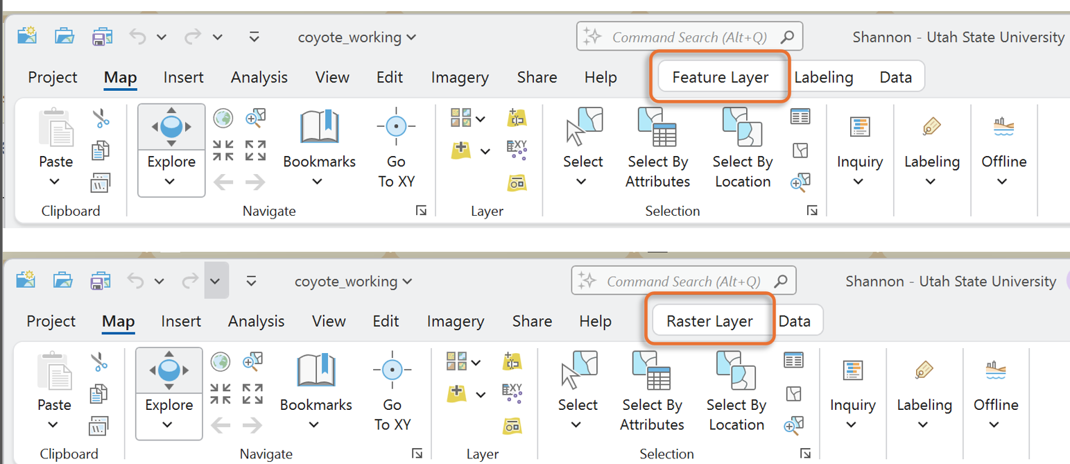
- Click on the usa_dem layer so that it is highlighted in blue in the Contents pane.
- At the top of the page, select the Raster Layer tab
- In the “Effects” section, slowly slide the top bar (transparency) to allow the hillshade layer to show through the elevation model.
- Set the transparency to around 50%.
![]()

Rasters are made up of pixels, like a photograph. We are working with rasters called ‘single band’ meaning each pixel can store exactly 1 single value. Elevation rasters (DEMs) store an elevation in each pixel: the average elevation for that pixel’s area on the ground. Alone they look kind of dull. Hillshade rasters, on the other hand, look amazing – all 3D-ish – shadowed. Just like the DEMs, each hillshade pixel store one value that ranges between 0 and 254. What do these values represent? What would the units of measure be for these values?
The values stored are a bin of volor. Color schemes are divided into 255 bins. The hillshade value represents the position along the gradient of color. Hillshade values describe which ‘bin’ color should be used. That’s it. Boring…
So, word to the wise (and to those still reading…) don’t ever include hillshade values in a legend. Don’t ever try to calculate the mean ‘hillshade’ for an area of interest. Use hillshades ONLY to make your DEMs look trés glamorous.
Drawing elevations with color
Notice we did not say 'draw hillshade with color.' Best practice to leave hillshade layers black to white.
- Click on the DEM’s color ramp in the ToC
- The symbology pane should open on the right.
- Leave the primary symbology as “Stretch” (this means blended)
- Select a color scheme.
- Hovering over the color ramps shows the names
- Experiment with different continuous options


Creating a Finished Product in Layout View
ArcGIS Pro has two display functionalities: Maps are where we explore data layers and perform data manipulation and analysis. Layout is a composition of one or more ‘maps’ along with supporting elements: title, legend, scale, descriptive text. Use Layout to fine tune your finished project, whether creating a printed map, poster, or exporting to PDF.
Open Layout View
- Activate the Insert tools by clicking on insert tab.
- Click on the New Layout drop-down arrow
- Notice the options. Choose a page orientation that works with the data extent (Landscape would work well in this case as the continental US is wider than tall)
- 8.5 x 11 suits the submission requirements
- Page setting can be changed later if needed


A blank “page” is displayed in the main window. This is the layout.
The Map and Layout are accessible via the tabs above the view window. You can toggle back and forth.
Add a Map Frame
To see your map on the Layout page, you need to ‘inset a map’ onto the layout.
Watch this for more information.

- Add a map frame to the layout by clicking the dropdown tab labeled “Map Frame”.
- Notice there are options.
- The default option is the full global extent
- The option with the scale uses the scale from your map view
- Choose the default option
- Notice the cursor changes to crosshairs: Draw a rectangle on the page to create a space for the new map frame
- Focus the map frame on the Contiguous US
- Right click > Zoom to Layer on the States_US dataset (remember, zoom to layer centers that dataset in the window or frame).
Manipulating the extent and scale of the map: Panning and Zooming
Watch this video to learn more about working with layouts in ArcGis Pro
Hover over the Explore Tool on the main ribbon:
These are the keyboard and mouse short cuts for moving around on the map.
Important: You can move around and resize the map AND the paper, independently, within the Layout tab.

If you want to move or zoom in on the Paper, click on Layout (notice the “hand” cursor, this allows panning around):

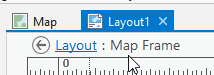
To zoom in (rescale) the map itself, right click on the map > Activate:

Notice under the layout tab, you have moved into “Layout: Map Frame” territory:
Now you can use the pan tool (hand) to click and move the MAP around within the map frame:

When you activate the map, you essentially revert it back to map view, but in the layout format.
After you activate the map you can then use the scroll with the wheel on your mouse until it fits the extent you need. You can move the map by clicking on it and dragging it across the screen.
Keep working on these steps until you understand how to manipulate the map frames, the layout, zooming in and out of page and the data within the page, and panning in each.
Center the contiguous US in the map frame
Deactivate the map and go back to layout view.
Click the back arrow

Changing the Display Coordinate System
The states look flat and stretched. This is due to the type of reference grid being used to draw the map.
You can explore coordinate systems in another exercise, but for now, know that you can change the look of the map by changing the “display coordinate system”.
- Open the Map properties (not the Map Frame)
- Double click “Map” or right click > Properties in the table of contents.
- In the Map Properties window, click on the Coordinate System tab
- From here, we are going to open the drop-down tab for Projected Coordinate System
- Open the Continental tab
- North America tab
- Select the coordinate system “USA Contiguous Albers Equal Area Conic”
- Click ok

Did you notice anything change? Look at the border between the US and Canada. It should have a curve now instead of being a straight line like before.
Being able to change the coordinate system of your project to most accurately display your data is an important skill. We will go over this many times throughout the semester. And in a couple of weeks you will know which coordinate system is best.
Changing the coordinate system probably changed the look of the map on the page.
Aren’t you glad you practiced panning and zooming in the layout and map views? Adjust the scale and extent of the continental US to fill the map frame.
Good
Titles tell the viewer What and Where.
Bad
Titles say things like:
- “Map of ...” (yes, we know it’s a map).
- “Map for Homework 2” (This isn’t third grade).
- “Lab 3 Map” (see 1 and 2)
Here’s how:
From the Insert tab > Text drop down > Symbol Drop down
- Scroll down and you’ll find options for Title text
- Choose one
- Draw a rectangle on the map in the general area of your title
- Type in something logical, for example: “Major Rivers of the Contiguous United States"

Note: you can edit the font size, color, etc. by opening the Element tab on the right, by right clicking the text box > Properties, or right clicking “Text” in the ToC > Properties
Add Text: Map author, date & data credits
Use the Text option from the Insert tab to add a text box with your name and the data sources for the data used in your map. (The data credits can always be found in the Data Descriptions at the beginning of the lab instructions.)
Map author, date, and data credits are usually placed at the bottom of the page and should not visually jump off the page. Keep them subtle, small, and pay attention to alignments.
Adding Data Credits
- Click on the New Text button
- Add a text box to the bottom of your map. This is traditionally where data credits are placed.
- Add your Name as the editor/author, the date of map creation, data credits
- Data Credits: NaturalEarthData.com, USGS (For example)
Service Layer Credits
If you use a basemap, ESRI dynamically and automatically places data credits on the map. These are generally quite in the way.
To remove these automatic basemap credits and instead include the text in part or whole in your manually typed data credits:
- Click the Dynamic Text drop-down tab (when in Layout)
- Scroll down until you see “Service Layer Credits” in the Layout section. Select it.
- Draw a box (click and drag) somewhere off the page. The credits are changed to a floating text box.
Parting Words about Good Maps:
- Strive for balance on the page, using color, size, and line weight to draw attention to elements that have the highest priority on the map.
- Don’t include information or elements that aren’t absolutely necessary.
- Fit your data on the page to maximize detail.
- Choose a scale and extent that is appropriate for your data.
- Have a descriptive and clear title.
- Intuitive data symbolization to support the map’s purpose.
- Always have credits for the data displayed in your map (including the basemaps).
Sharing Your Map
Maps are made of complicated layers of data with symbology and other layout details that must be compressed to a shareable file format. To share maps you must export your maps to a standard and compressed format. PDFs work very well to preserve the resolution and detail of your maps. You can also export to PNG or TIF.
Exporting
- Go to the share tab at the top of the Project.
- Click the green arrow labeled Layout in the Export box.
- Select the location to which you would like to save your exported map.
- Name it something intuitive and descriptive
- Set the save as type (PDF? or PNG?)
- If given the option, set the DPI to 150
- Higher resolution is good in specific situations.
- For our purposes, 150 dpi works well.
- Export
