Displaying XY Data
And more on Coordinate Systems
The Basics:

In this lab you will take a simple table of data (a spreadsheet) and turn it into a map.
This will be possible because the table contains columns with coordinate values. The other columns will become the attribute information associated with each point location.
The information in the table describes Northern Shoveler duck locations. The birds have a band put on their leg at their nesting location. Location is stored as XY “banded” coordinates. Then when the duck dies, the band number is called into the Bird Banding Program and the location at time of death is recorded (as “recovered” coordinates).
The table contains a row for each bird. Each bird has two pair of coordinate values: banded and recovered. You will display and then project the point data of both the banding locations and location at time of death for all the birds in the record.
Background:
(Lab Originally Conceived by Chris McGinty and Suzanne Gifford.)
Since 1920, the USGS has maintained a large long-term dataset on all species of birds banded in North America: http://www.pwrc.usgs.gov/bbl/
For the purpose of this exercise, data from the USGS database have been downloaded for you and saved in a csv spreadsheet. The data have been sorted and simplified to include only the wild Northern Shoveler (Anas clypeata) which were banded at their summering grounds and recovered at a variety of locations, but primarily at their wintering grounds.
Data
NS_Data.csv:
- Spreadsheet containing banding and recovery locations for over 2000 Northern Shoveler ducks.
- The location coordinates are stored in the NAD 1983 coordinate system.
- Data from the USGS
Data preparation:
In Excel, open the spreadsheet NS_data and look through the contents to see what information has been provided. Data relevant to banding are labeled “B” and data relevant to recovery are labeled “R.”
Make sure you understand the column headers.
Look at the Coordinate Values
You should be able to tell in which type of coordinate system (projected or geographic) the data were collected and stored.
Think about the values. Are they big numbers or small numbers. Angles will be smaller values (less than absolute values of 180) while planar coordinates are typically large numbers (hundreds of thousands or millions). What are the units? If meters, then how would you expect this data to plot up and where? If degrees, how would you expect it to plot up? Which type of coordinate system, geographic or projected, has units of degrees?
Coordinate values come from specific coordinate systems
It is a very simple process to import spatial data in tabular form (spreadsheet) into ArcGIS Pro and display the coordinate pairs as spatial locations on a map. However, there are about 15 places this process can go wrong. But hopefully you will become a master of coordinate systems and will be able to troubleshoot any issues that arise.
You will be displaying the banded and recovery data as two different data sets (one displaying banding locations, one displaying recovery locations of each bird).
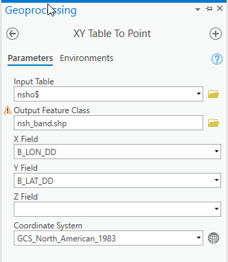
- Display the XY data
- Right click the table in the Table of Contents
- Create Points from Table ->XY Table to Point
- Output Feature Class: Ensure your output file will be saved to the data folder of your choice
- Name your Output Feature Class (Banded)
- Set which columns are your Banded Longitude and Latitude (B_LON_DD, B_Lat_DD). Y is latitude, X is longitude
You must tell ArcGIS Pro in which coordinate system the data coordinates were collected.
User defines the reference framework the coordinates values were measured on initially - not the coordinate system we ultimately want to display it in. Keep reading…
Again, you must define the coordinate system in which the data were stored not the coordinate system in which we want to display them.
Take a look at the data in Excel:
What do you know about these coordinate values? They are consistently small numbers. If we were to add these coordinate pairs to ArcGIS and assign the values units of meters, all of the banding points would display within 180 meters of the coordinate system's origin (0,0). At most, the data would span 360 meters west to east.
That isn't correct, is it?
In order for these values to display correctly, they need to be assigned degrees as their unit of measure. And the column header even tells us the unit is decimal degree.
These coordinates are latitude / longitude, a geographic coordinate system (GCS).
Remember that there are several versions of geographic coordinate systems used in North America (depending on the datum on which they are based: NAD 27, NAD 83, and WGS 84).
We can’t guess or pick our favorite. The USGS Bird Banding Laboratory website tells us that this data has coordinates based on the North American Datum of 1983 (NAD 83).
- Verify that this is the coordinate system set in the tool.
- it is not, set it navigating through these folders:
- Geographic > North America > USA and Territories > NAD83
- Run.
Your new shapefile should be in your Table of Contents. The points should appear on your screen.
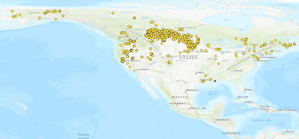
Here is a video walking through the process of displaying the banding points.
The software has updated. To display the points, right click the table, Create Points From Table, XY Table to Points.
And here is a demonstration of what can go wrong if you assign the wrong coordinate system when displaying XY data. And more importantly, how to troubleshoot when things go wrong.
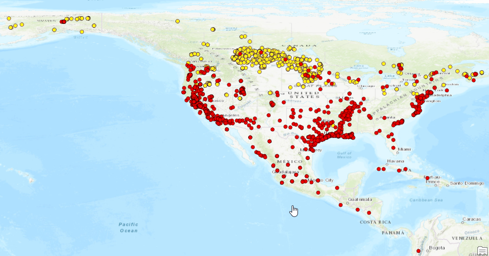
Add Recovered data points:
Now repeat with the coordinate values belonging to the locations at which the birds were recovered.
Your map should look something like this:
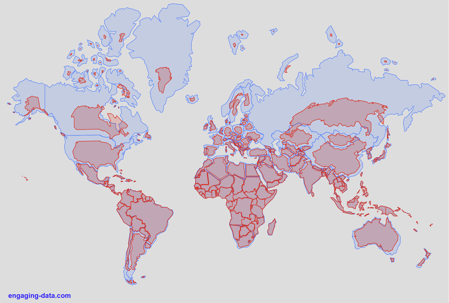
True size of countries - versus Mercator distortion.
Geographic coordinate systems are short and wide. Very distorted areas. A projection can help present data in a more natural, intuitive way.
Changing the coordinate system of the map display
Let’s change the map display to a projection suitable for North America, because that’s the general extent of our data.
Right click on “Map” in the table of contents and open the properties > coordinate system section
Remember the 4 basic folders, go into the Projected Coordinate Systems folder > Continental > North America
I like the North America Lambert Conformal Conic for this as we are just displaying data, not making any measurements:
Please see the Canvas assignment page for Submission Details.