Spatial Data: Vectors
Different ways to represent locations (and store information about those locations)
The Basics
In this lab you will explore some local data. And we don’t just mean explore maps, we mean explore the structures of vector data and the attribute data connected to them.
We’ve put together this exercise in two parts and have a series of questions to help you focus on the details that make raster and vector data interesting and unique.

The first part focuses on details of vector data: discrete points, lines, and polygons. The second part later in the semester) focuses on the characteristics of raster data.
You will submit answers to questions found in the lab instructions and a formal map. This week’s map will be evaluated for a well edited legend as well as a clear map purpose (title unified with symbology and scale/extent of the data).
Use the answer form on Canvas to submit your answers to the questions peppered throughout the instructions. You should reference the questions in the answer form on Canvas.
Getting Started
- Set up a workplace folder for this exercise
- Call it, oh I don’t know, “Lab_2”
- Put the workplace in your GIS_Class folder
- Download the data from Canvas and unzip to your workplace folder
- Start ArcGIS Pro
- Click the map template to start a new project
- Save the project to your workplace folder (same location as your data)
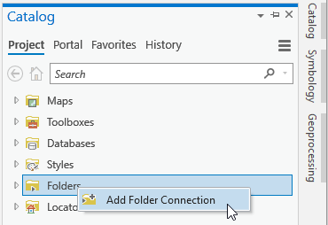
- Set your folder connections.
- Add data
Data
- Logan_city_limits.shp (UT AGRC) - Polygon shapefile containing boundary of Logan City
- CensusBlocks2010.shp (UT AGRC) - Polygon shapefile containing census block data for Cache County
- StreamsNHDHighRes.shp (UT AGRC) - Polyline shapefile containing stream and river data for Utah
Data Preparation
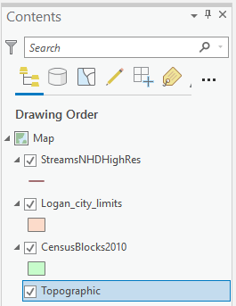
- Organize your Table of Contents
- Streams
- Logan City Limits
- Census Blocks shapefile
Polygons are areas. Unless you change the symbology, you can't see what is drawing beneath them.
Change the Display Coordinate System:
Changing the display coordinate system is a task that should be second nature to you by the end of this course.
- Right click or double click the Map layer in your Table of Contents (ToC) to open the properties window for the Map.
- Go to the Coordinate Systems tab.
- Set the coordinate system to NAD 1983 UTM Zone 12N if it isn’t already.
This is a good coordinate system for Utah.
- Projected > UTM > NAD 1983 > Select Zone 12N
- OK
Reading the Table of Contents
The symbols in the contents pane show us what kind of data each layer is.
The Census Block and City limits are polygons which are represented by boxes. The Streams data set is a polyline layer.
Vector data (points, polylines, and polygons) are considered discrete data. There is data at the vertices, at the lines connecting the vertices, and in the areas defined by connecting beginnings and endings of lines, and no where else on the map. (Note: closed polylines are still polylines. A polygon is a different geometry.) We will discuss the other primary data type in the exercise called "Introducing Rasters."

Select Map Features using Attributes
Task: Find and isolate the Yellowstone River and calculate its length.
- Right click the streams layer (ToC)
- Open the Attribute Table (the database connected to the mapped features)
- Right Click the GNIS_Name field and sort descending
- Scroll down until you find Yellowstone River
- Notice there are multiple records for the Yellowstone River.
- Each row represents a segment of the polyline.
For example: Yellowstone River is represented by many polyline segments. And there may be more than one "Yellowstone River" in the dataset. It is a pretty well known name, afterall.
Another example: Shore Drive is a road that winds along the north shore of Lake Minnewashta. In the map shown below, it happens to consist of four polyline segments that begin and end where the polyline intersects with other road segments.

Each segment has its own row in the attribute table. This Shore Drive is made up of 4 records/features. If you searched the attribute table for Shore Drive, found and selected a row with that name "Shore Drive" not only would you not have all of Shore Drive accounted for, you might have chosen a different Shore Drive than the one on the north shore of Lake Minnewashta ((turns out Minnesota has more than one "Shore Drive" - go figure.)
Correspondingly, if you searched the attributes by name and found all the Shore Drives in the attribute table, you would be selecting more than our particular road. Using the attributes AND inspecting the map is very important.

How wide is a road? How wide is a river? A polyline is width-less. It only has length. Do you think a polyline maps the exact center of the linear feature it represents? How carefully or precisely does a polyline match its real world counterpart?
Zoom in on your map and evaluate. At what scale is the polyline a suitable representation? If you were to calculate the length of a linear feature (like a road or a river) by summing the segment lengths that together represented the real world feature, how exact would you consider that number?
Here's how to think about decimal places in this class:
If you measure the length of a polyline and report the length as 200,000.2112 meters you are telling me you are certain of the length right down to the tenth of a millimeter. Spatial data will never be that precise.
For our purposes, rounding to the nearest integer is a good practice. Spatial data precision and accuracy (quality) is sometimes found in an associated quality report.
- Select all Yellowstone River segments in the attribute table using the SHIFT key
- On the far left of the table click the grey box that corresponds with the first record for the Yellowstone River
- Scroll down to the last Yellowstone River record.
- Using the Shift key, click in on the last record to select all records for the Yellowstone River
- If you mess up, use the "clear selection" button in the Selection section of the Map tab at the top of ArcGIS.

You can see how many records you have selected in the bottom left of the attribute table.
I'll give you this first one. You should have 103 records selected.

Look at the map. Do you see Yellowstone River highlighted in the Uinta Mountains?
- Press the “Zoom To” button in the attribute table to fill the view window with the selected elements.
Calculate Geometry
Length (with known units of measure)
Look in the attribute table for the field called “SHAPE_ Leng”. These lengths are the lengths of each line segment.
What are the length units associated with these values?
We don’t know right now, so let’s calculate the length of each segment and choose deliberate units.
Areas of polygons, lengths of lines, and XY coordinates of points (and more) can be calculated in the attribute table using a tool called Calculate Geometry.
You can search for geoprocessing tools and tasks a few different ways.
1) Analysis menu > Tools opens the geoprocessing window in which you can search for tools using keywords.
2) Clicking the 'toolboxes' tab under the search bar allows you to browse through all the tools.
3) Doing a google search using keywords like "ArcGIS Pro" and "calculate area of a polygon."
This is helpful when you can't remember the tool name or workflow.
The geoprocessing window is a good one to pin and keep handy.
- With all of the Yellowstone River records selected, right click the SHAPE_Leng field header in the attribute table and select Calculate Geometry.
Notice a few things:
Geoprocessing simply means you are processing geospatial data.
You can search for geoprocessing tools and tasks a few different ways. 1) Analysis menu > Tools opens the geoprocessing window in which you can search for tools using keywords. 2) Clicking the 'toolboxes' tab under the search bar allows you to browse through all the tools. 3) Doing a google search using keywords like "ArcGIS Pro" and "calculate area of a polygon." This is helpful when you can't remember the tool name or workflow.
The geoprocessing window is a good one to pin and keep handy.
- In the Geoprocessing window that pops up on the right
- Set the Property to Length geodesic).
- Set the Length Unit to Meters.
- Set the Coordinate System to the match the source layer
Note: it will populate the box with the coordinate system NAD 1983 UTM Zone 12. This is the most common coordinate system used in Utah.
-
- Press Run at the bottom of the geoprocessing window
- Verify the results
Evaluating results is a habit we will be forcing you to adopt this semester.
Why?
GIS is a slick easy tool that can and will provide you with many opportunities to fail on any given workflow. It will also hand you very precise looking answers that if you stop and look make no sense what-so-ever.
Have a prediction for a reasonable result in mind when running tools. Check your results.
Almost instantly the lengths should be updated and it’s possible there is no change. But now we know the lengths are correct and we know the units are meters.
Note that this calculation was only performed on the lengths of the selected records, not for the whole table.
How long is the Yellowstone River?
You could get out a calculator and add up all the lengths you just calculated. But don’t do that! This is GIS. Automating simple calculations like this is one of 2000 reasons it was invented.
Summing Lengths: Statistics Tool
To find the length of the Yellowstone River use the statistics tool in the attribute table.
- With all of the Yellowstone River records selected, right click on the SHAPE_Leng field and select Statistics.
Note: Take a careful look at the Chart Properties pane on the right.
- There should be two columns. One for the whole dataset (all the stream segments) and one for the selected records (the Yellowstone River).
- What is the Count of selected records?
- The count is the number of records being summarized. How many Yellowstone River records were there? The Count should match that number.
To see a histogram of the lengths of the selected features:
Verify the count matches the number of selected “Yellowstone River” records.

Round to the nearest TEN meters!
(Why? Because this is a coarse representation of an actual river. It is not precise to the nearest meter. Reporting decimal places in this case is false precision and is theoretically incorrect.)
Clearing selections
At least two ways to do this:
- One way: clear selection from within the attribute table:
- Another way, clear selection from the main ribbon


Selecting by Attribute (again)
In the previous example, you manually selected records sharing a common attribute, the name of the river. There is a tool called “select by attribute” that allows you to select features using simple queries.
The query for the previous selection would look something like this:
Select records from the StreamsNHD layer where GNIS_Name = “Yellowstone River”
GNIS_Name is the field header for one of the columns in the attribute table.
Use Select by Attribute to find out many of the stream segments have the name “Dolores River”


- Open “Select by Attribute” from the Map tab
- You can also find a Select by Attribute tool shortcut in the layer's attribute table. Same icon.
- The Geoprocessing pane opens and the Select by Attribute tool is cued up
- Check the inputs
- Rows are from the StreamNDH layer
- Selection type is New (this will clear any previous selections)
- Click to add a New Expression
- Create the expression “where GNIS_Name is equal to Dolores River”
- Run
(We're asking this for a couple of reasons. First, to help you verify that you are making careful selections. Second, to reinforce what a polyline is and how an entity like a river or road is represented by a series of polylines. Each polyline segment has a row in the attribute table and it's own attributes.)
Close the Stream NHD attribute table and turn off the layer’s visibility in the table of contents.
Select by attribute - Now you do it
Turn on the Census Block dataset. These are polygon areas defined by the census bureau.
Open the attribute table and look for a field called POP100. These are the populations for each polygon (census block) in 2010.
Note: this polygon data is different than the polyline stream data. Each record represents one census block polygon. The stream data had a record for each line segment.
Use Select by Attribute to determine how many Cache County census blocks have exactly one person living in them.
How many people were living in the most populated census block in Cache County in 2010?
Normalizing Values
Now let's figure out where the most crowded census blocks are.
Population might be related to census block size, or might not.
It would be interesting see which blocks are more crowded - higher populations for smaller block size. The raw counts don’t tell us about how crowded or dense the census blocks are.
To find which blocks are more densely populated we need to compare the raw population count to the area of the census blocks. In other words, we are going to normalize the population counts.
Normalize the population data by dividing the population of each block by the area of each block. The results of this calculation are population densities. We will calculate people per acre.
Workflow:
- Verify census block areas (in known units - acres)
- Divide population column (or field) by area field
The tool that does math using the data in the columns is called “Field Calculator” because columns are called fields in ArcGIS.
Here's how:
Step 1: Calculate Geometry (to get correct polygon areas)
We need to add a field to the Attribute Table that will calculate and store the area of the census blocks in acres.
- Click the Add Field button
- Name the new field “Area_Acre”
- Set the Data type to Float


- Float means Floating Point, which allows the values to have fractions (decimals).
- Double = bigger range of floating point values
- Short = Short Integers; fractions round up to the next whole number.
- Long = Long Integers; stores larger integer values
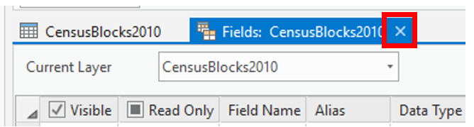
- IMPORTANT: Save your table edits by pressing the big save button in the ribbon at the top of ArcGIS.

- Exit the “Fields:” tab where you edited the field and go back to the “CensusBlocks2010” attribute table
- Right click the header of the newly created field, and select Calculate Geometry
- Input Features should be CensusBlocks2010
- Target Field should be Area_Acre
- Select “Area” in the Property drop-down
- Set the Area Unit to Acres
- Set the Coordinate System to the Current Map (Remember, you set the Map coordinate system at the very beginning to NAD 83 UTM Zone 12?)
- Press Run.
Field Calculator
Step 2: Making calculations between attribute fields
The Field Calculator calculates between fields. For example, you can: Add fields together (add monthly precipitations to get annual precipitation), Subtract fields (reservoir volume in 1980 minus reservoir volume in 2010) and so much more!
The results of your field calculation should go into a new (empty) field (column).

- Add a field to the census attribute table called popden_ppa
- Population density in People Per Acre
- Set the Data Type to float
- Click the save button in the ribbon up top
- Right click your newly created field header and select Calculate Field
- Input table should say CensusBlocks2010
- Field Name should be popden_ppa
- Set Expression Type to Python 3 (or SQL)
- Set the expression to say POP100 / Area_Acre
- Double click POP100 in ‘Fields’
- Click the division symbol “/”
- Double click Area Acre
- Run
Evaluate the results
How can you determine if the calculations are correct?
- Look at the areas, do they look to be reasonable values for acres?
- Look at the populations.
- Does the division math for each row look correct?
- Sort the results, highlight a row with high density,
- Where does it appear on the map?
- Does that location make sense? (You might need to add a different basemap)
- Repeat with blocks that are low density.
- Do those locations make sense?
- Add a basemap with satellite imagery if you are unfamiliar with Cache County.

What is the highest population density in Cache County (in people/acre)?
The units are critical. If you calculate area in square meters you will get values representing people per square meter which is very different than people per acre.
Select by Location
Isolate the census blocks found within the Logan City limits.
You can use a dataset (say the outline of a city) to select features from another dataset (ex. Parks or schools or… census blocks). i.e. select all parks within Logan City limits.
The tool is called “Select by Location” because you are using the location of one dataset to select features from another dataset.
The features that you want to select are called the Input Features. The shape you are going to use to do the selecting is called the Selecting Feature.
Selecting features just “picks” them –changes their color to a highlighted color. You aren’t changing the data or deleting anything or making any kind of permanent change. So relax. Experiment. Select, clear your selection, select again a different way, etc.
Open Select by Location
Found on the Selection panel of the main toolbar:

Tool pane opens on the right.
- Read through the tool options.
- The “selecting feature” is… review “you should know” section above
- Set the Input Features
- Reason this out
- Set the Relationship
- You can/should experiment and try intersect, within, completely within
- Evaluate (look at) the results
- Clear the selection, change the relationship method, run again
- Ultimately run Have Their Center In
- You can/should experiment and try intersect, within, completely within
- Run
Turn this selection into its own dataset
Make a copy of the selected features and “paste” them into their own new shapefile.
This is REALLY handy. Remember this trick!
- Right click on the census block layer in the ToC
- Data > Export Features
This opens the Feature Class to Feature Class tool
- Fill in the top three inputs
- What features are you ‘exporting’
- What folder are you putting them in
- Give it a good (meaningful) name
- You don’t need an expression and you don’t have to deal with the field map stuff.
- Run
- Evaluate the results
- Turn off the inputs so you can verify that it worked correctly
Symbolize by Attribute Value
Let’s show the results of the population density calculation on the map.
You did this last week, assigning random colors to the state polygons.
This time, you will display polygons based on a value.
Show more densely populated census blocks in a dark color and the less dense blocks as a lighter color.
- Left click on the symbol for the census layer (ToC)
- The Symbology window will open on the right
- Click on the back arrow if you see the Format Polygon pane.


Right now, all polygons are being drawn with the same color: Single symbol for all.
Previously, you colored polygons randomly to reflect the categorical nature of state names.
We want the census block colors to reflect the changing density values. Use a graduated color scheme so the intensity of the color increases with the increasing value. This communicates the order of the data.
Graduated Color
You can have the colors “graduate” as the population density values change. This involves “classifying” the data into groups. We will discuss this in detail later, but you should see how it works now.
- Select Graduated Colors under the Primary symbology drop-down tab
- Set the Field to popden_ppa
- Method = Natural Breaks(Jenks) (more about this later)
- Number of classes = 5
- Try 5 then experiment using 10 etc.
- Pick a color scheme from the drop down by the color bar
- You may want to reverse the color scheme to make the highest density blocks show up the best against the basemap (think about contrast). (Contrast attracts our attention.)
- In the color scheme drop-down bar, click Format Color Scheme
- Click the reverse color scheme button
- Press OK

- In the lower panel that shows the classes with labels, click on the color box of your lowest value class and set the color to transparent. This takes the focus away from all the census block with very low densities.
Manually adjust the remaining colors to make them easy to differentiate.
Here's a demo:
Legends
Legends are only necessary when they explain something not obvious from the title, caption, or symbology.
In this case, we have density values we might want to explain.
Edit your legend to suit your audience.
If your audience is looking for a general idea, you might simplify the maximum density to something humans can relate to like people per square foot or even equating the density to a well known area like Wyoming or the city of Los Angeles.
If the audience is looking for more specifics, rounding the values of each class might be appropriate.
Here's how:
- Layout > Insert menu > Map Surrounds section > Legend
- Draw a space on your layout for the legend
- Edit the legend
Editing the legend:
Assignment
- Submit answers to the questions in the instructions using the Answer Form on Canvas
- Create a map showing the population density of Logan city. That’s your map’s purpose.
Clean up your map for submission
- Zoom to the extent of the Logan City Limits dataset
- Contents > Right click Logan City Limits layer
- Zoom to Layer
- Turn off the visibility of the Logan city polygon and all other non-necessary data layers
- Or symbolize them in a way that supports the census blocks density message
- Choose a basemap that provides spatial context like roads, city labels, terrain
- But remember the density information is the most important feature. Don't include a lot of distracting map junk.
- Experiment with the transparency of the census block layer
- Appearance Tab
- Find the transparency tool
- Why? Because you don't want to hide all the important landmark and spatial context underneath the solid-fill polygons
- Insert menu > new Layout. Portrait would work well with the shape of Logan City
- Insert a map frame choosing your Logan density map
- Adjust scale and extent to maximize Logan area on the page.
- You may need to choose a different color ramp that illustrates the increasing densities most effectively
- Add Text (Insert menu > Graphics and Text) to include the data credits for the Census data and the basemap if you use one.
- Remove the basemap ‘dynamic text’ credits.
- Insert menu > Graphics and Text section > Dynamic Text
- Draw a rectangle off the "page" to store the dynamic credits out of printing view
- When you are happy with the image, Export the map to PDF, 150 dpi.
Save project and close. That’s it.