Presenting Your Results
Introduction to data visualization and layouts
In this last module we will explore spatial data visualization and presentation. You will create a formal map with a clear purpose and strong attention to cartographic details and submit it for feedback.
Outline:
- Repairing Data Connections
- Symbolizing Elevation Data (rasters)
- Symbolizing Vectors by Attribute Value
- Display Coordinate Systems
- Maps and Layouts
- Cartographic Elements
- Sharing Maps
Set up:
- Start a new map project and add the data from the zipped folder provided for this exercise.
- Arrange the data in the contents pane to ensure vector data is drawing above raster data.
- Remember, the symbols in the contents pane show you what type of data it is.
- Points, lines, polygons = vector
- stretched color ramps = raster
Data:
Unit 4 Cartography
- cities (NationalAtlas.gov)
- earthquakes (usgs.gov)
- nuclear_facilities (mapcruzin.com)
- rivers_us (NaturalEarthData.com)
- state_capitals (NationalAtlas.gov)
- states_us (Mapcruzin.com)
- roads_us (NationalAtlas.gov)
- USA_dem (USGS)
- USA_dem_hs
Repairing Data Connections
Notice the red exclamation mark next to the state capitals layer in the contents pane. Hold up – there are two state capitals layers, each with different symbology. What’s the deal?

One of these is the original shapefile and one is a version of the original that contains special symbology – the stars. Yes, you can save the symbology changes you make to your data.
Let’s dig in to learn more.
- Turn off the visibility of all layers except these two and zoom to the continental US.
Do you see the yellow stars? No.
Maybe they are displaying somewhere else in the world.
You could try zooming to the layer with stars to see if it is drawing somewhere else on the map.
Right click the layer in the contents pane > Zoom to layer.
Hmmm. That doesn’t work, either. No stars.
Remember that the data layers aren’t stored in the map project. The project saves the path to the data layer locations in your files. We can see those paths by displaying the contents pane differently.
2. Click the cylinder to change the contents list to display the path to the data’s source location.
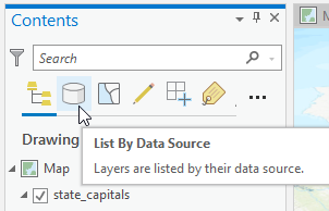
You might want to expand the width of the contents pane to see the full text of each path.
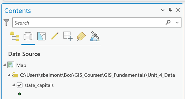
Note: The paths you see to your data won’t match mine, because you downloaded the data to your computer and then added it to your ArcGIS Pro project. The project is mapped “correctly” to the location of the data and should be displaying on your map. Except for the state capital stars.
When you save your map project, it saves the path to each data layer. It doesn’t save the actual data. Just the location of the data on your computer.
Therefore, if you reorganize your data (clean up your files, move files around, rename folders…) and then go back to working in your ArcGIS Pro project, any data layer with a change made to its path will not display in your map. You’ll see a red exclamation point. The path to the data changed (it is broken).
My data is sitting exactly where you see it in the path shown in the image above. Your path will be different and local to your download location.
3. Look at the path to the state capitals layer with the yellow star symbology.
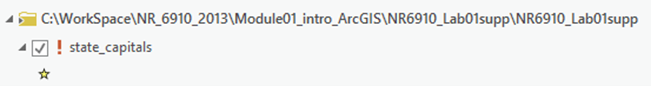
Ok, the star symbols aren’t important. They were included to help demonstrate how data paths work and to reinforce that the data isn’t saved in the project. The project only saves the paths to the data.
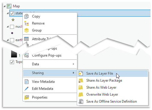
Save time by preserving laborious symbology changes you make to your data. The symbology can be saved to an accompanying file called a layer file.
Layer files store symbology changes to the dataset along with the layer file’s location (path).
Repair the broken data link
- Left click the red arrow
- This opens a “Change Data Source” window. Handy, huh?
- Navigate to the location of the state_capitals shapefile
- Not sure where that is, just look at the path!
- Select the state_capital shapefile > OK
The path to the symbology layer file is updated, the layer file moves in the contents pane (now it’s listed with the other data in that folder), and it draws on the map! You can turn off the visibility of or just remove the state capital layer symbolized with plain points.
*********
Why did I spend so much time explaining this?
Because it is imperative that you understand how spatial data files interact with the ArcGIS Pro interface.
The location paths for standard data files are stored in the project’s memory (the *.aprx project). If you move data or rename a folder in which the data is sitting, the path changes. The ArcGIS Pro project doesn’t automatically know that. It will look to the path it has stored (which doesn’t exist anymore) and throw you an error: a broken path exclamation point.
But no worries.
If the data still exists you can simply update the path in the project’s memory. Repair the path.
(Layer files store the path within their metadata, which is a little different. When you save a project, the layer file’s saved location is not updated. You have to resave the layer file to save the path to the new location.)
In the rare chance you haven’t tuned out and want to know more:
Some Arc tools – especially the Spatial Analyst tools - are very picky about the syntax contained in the path. The path cannot contain spaces or file or folder names that start with numbers or contain special characters. Get in the habit of replacing spaces with underscores to save yourself a world of hurt later.
In the rare chance you haven’t completely tuned out and want to know more:
Some Arc tools – especially the Spatial Analyst tools - are very picky about the syntax contained in the path. The path cannot contain spaces or file or folder names that start with numbers or contain special characters. Get in the habit of replacing spaces with underscores to save yourself a world of hurt later.

Displaying Elevation Data
In the exercise Introducing ArcGIS PRo, you got some practice symbolizing vector data: points, lines and polygons.
Elevation data (commonly called DEM for Digital Elevation Model) is raster data and is symbolized differently.
Set up:
First things first, turn off the visibility of all vector data and turn on the visibility of the usa_dem and the corresponding hillshade layer (usa_dem_hs).
- In the Contents, place the DEM above the Hillshade.
- The Hillshade layer is a display tool that helps make the DEM look like the 3-dimensional terrain it represents.
- Typically, I name the hillshade with “hs” at the end of the file name
- Don’t try to use the Basemap Hillshade. The basemaps are a different thing altogether.
Add Color to the Digital Elevation Model
Symbolize elevations with color
Notice we did not say “add color to the hillshade…”
1. Click on the DEM's color bar in the contents pane
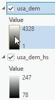
The symbology pane should open on the right.
2. Leave the primary symbology as "Stretch" (this means blended - not broken into classes)
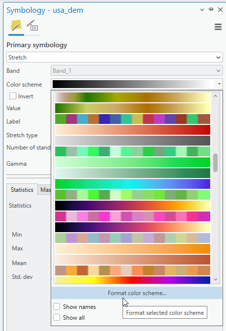
3. Select a color scheme:
- Hovering over the color ramps shows the names
- Or turn them on
- Experiment with different…

We must stop and discuss COLOR
Picking a color scheme is an important aspect of cartography. When you see a blue blob on a map, your instinct probably reads it as water. A good map has intuitive colors that represent the data being visualized.
Colors are intuitive.
Experimentation is great, but choose colors and color sequences that reinforce what you are trying to communicate with your map.
Check out this blog post by the brilliant ESRI Cartographer, Heather Smith, on Color Connotations and Associations.
There are several ways that color schemes are set up.
Stretch/Continuous:
![]()
Continuous color schemes show a smooth gradation of one or more colors. Continuous color ramps are appropriate for data with a range of continuous values with a rank or even with ‘good’ ‘better’ ‘best’ data. Continuous color ramps can be classified.
Discrete:
![]() Random/Categorical
Random/Categorical
![]() Sequential
Sequential
Discrete color schemes work well with categorical data if the colors are random. Features of equal value but with unique characteristics. But continuous data can be displayed as classified (in discrete classes). Care needs to be given when classifying continuous data so the classes represent the data accurately.
Divergent:
![]() Divergent
Divergent
![]() Discrete Divergent
Discrete Divergent
Divergent color schemes can be continuous or discrete/classified.
There is a neutral color in the middle that denotes a change in value or meaning, and the values increase from the center point. It might be effective if you want to show distributions of annual rainfall above or below a 30-year average.
Light colors read as higher, dark as lower.
Dark appears to (visually) sit back, light comes toward us.
Good rule of thumb to be aware of…
Here’s how to reverse the color scheme to represent high elevations with the light end of a color ramp.
Find this symbol:
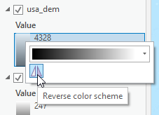
You can also reverse the color scheme in the symbology pane by formatting the color scheme.
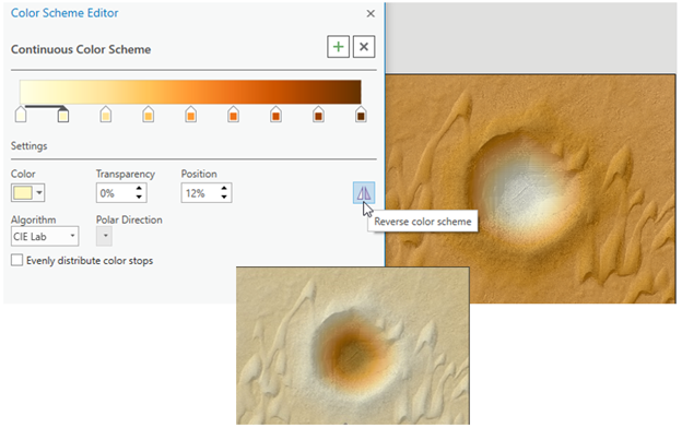
You can see that both images read clearly, but your message is strengthened by leveraging what is natural for our human perception.
The colors you use to visualize your data impact how it is viewed by others.
Interesting in more information about choosing colors for maps? Check out this collection of blog posts from Esri Cartographer Heather Smith. She is great at describing the process of choosing colors to maximize map readability using our natural intuition about color.

Experiment and then make a decision about a color ramp for your elevation data.
Next:
Transparency and Layer Blending
One way to adjust the look of the layers is to adjust the transparency. By making the “top” layer (in this case, the DEM as it is listed above the hillshade) partially transparent, we can see through to the hillshade, which is the layer that helps bring the landscape to life.
- Click on the usa_dem layer so that it is highlighted in blue in the Contents pane.
- At the top of the page, a new tab appears above the main toolbar: Raster Layer
- Click the Raster Layer tab to show the display options for the raster layer.
- In the “Effects” section, slowly slide the top bar (transparency) to allow the hillshade layer to show through the elevation model.

Another way to adjust the look of the layers is to use the Layer Blend modes.

Here are some examples of different blending techniques:

Symbolizing by Attribute Value
Let’s symbolize the Nuclear Facilities according to how many reactors there are at the site.
- Open the attribute table for the nuclear facilities dataset. Find the field with the reactor information.
We have options for displaying points by either graduating the size or graduating the color. Altering the point size makes sense to me for showing different counts.
- Left click on the symbol for the nuclear facilities in Contents to open Symbology
- Use the back arrow in Symbology to get back to the primary symbology page
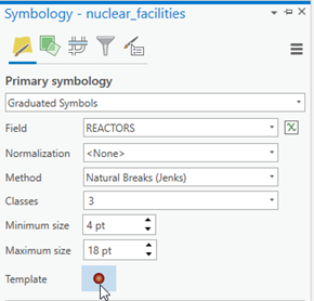
- Drop down the Primary Symbology menu – choose graduated symbol
The Field option defaults to the first numeric field found in the attribute table. This is often some kind of code that is meaningless to the map.
The Field setting tells ArcGIS which field you want to pull the values from to create the symbology.
DON'T CARELESSLY ACCEPT THE DEFAULT FIELD SETTING
- Set the field to the Reactor number field
- Use the Template to adjust the color of the symbols.
I used the buffered graduated fill and changed the colors:

Changing the Display Coordinate System
The states look flat and stretched east-west. This is due to the type of reference grid being used to draw the map.
You can change the look of the map – making it look more natural - by changing the “display coordinate system”.
- Open the Map properties
- In the Map Properties window, click on the Coordinate System tab

- Open the Projected Coordinate System section
The coordinate systems are organized into 4 sections (shown above). You can customize to save your Favorites, Layers will show the coordinate systems of the data found in your contents pane (can be a nice shortcut), Geographic coordinate system contains all the geographic coordinate systems (you read about those in Unit 2), and Projected Coordinate System is where you will be going now:
- Open the Continental section
- North America section
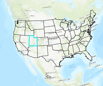
- This is because you will be making a map of the contiguous US. If you choose to focus in on a particular state, hang tight.
- Select the coordinate system “USA Contiguous Lambert Conformal Conic”
- It’s alphabetical
- Click ok
Did you notice anything change? Look at the border between the US and Canada. It should have a curve now instead of a straight line like before.
Being able to change the coordinate system of your project to most accurately (and pleasingly) display your data is an important skill.
Changing the coordinate system probably changed the look of the map on the page.
- Adjust the scale and extent to refocus the map, if necessary.
Other coordinate system options:
If you decide to make a map of Utah (or another state), you will want to choose a display coordinate system that displays the map correctly (i.e. north up) for that area.
The easiest projected coordinate systems to navigate to at this stage are the State Plane systems.
Utah Example:
- Go back to the Projected Coordinate System folder and scroll down to State Plane.
- Scroll down to NAD 1983 (Meters)
- The states are alphabetical. Most states have more than one zone. Choose the one that suits best.
The full extent of the map might look a bit wonky, but zoomed in will be oriented correctly for Utah:
Maps and Layouts
Maps are where you perform data manipulation and analysis: where you do the work.
Layouts (Page Layouts) are where you compile and organize map frames and other map elements on a virtual page for printout or sharing.
Map Frames are the frames on the layout that display each map.
Insert a Layout
- Insert tab > New Layout
- Notice the options for page orientation and size.

-
- (Landscape would work well in this case as the continental US is wider than tall)
- 5 x 11 suits the submission requirements
- Page setting can be changed later if needed
- Choose an orientation the best suits your data extent or layout plan.
A blank “page” is displayed in the main window. This is the layout.
The Map and Layout are accessible via the tabs above the view window. You can toggle back and forth.

Add a Map Frame
Maps sit in Map Frames on the page layout.
- Add a map frame to the layout from the Insert ribbon.
- You won’t see the option to insert a Map Frame unless you are in a Layout
When you click on Map Frame, the options shown in the drop down are your different maps. If you only have one map, you’ll see your map and a default global extent.
(Why would you have more than one map? Good question. You might want to show your data at multiple scale. In order for the layers to behave independently in the layout, you create independent maps, and insert them into different map frames on the layout. Clear as mud, I know.)
-
- The option with the scale uses the scale from your map view

- Choose the default option
- Notice the cursor changes to crosshairs: Draw a rectangle on the page to create a space for the new map frame

- Focus the map frame on the Contiguous US
- Right click > Zoom to Layer on the States_US dataset
- Center the contiguous US in the map frame
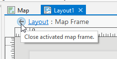
- Deactivate the map and go back to layout view.
- Click the back arrow
Here’s a little more information about manipulating, zooming, and panning within map frames and on the layout
Manipulating extent and scale: Panning and Zooming
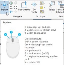
Hover over the Explore Tool on the main ribbon:
These are the keyboard and mouse short cuts for moving around on the map.
Important: You can move around and resize the map AND the paper, independently, within the Layout tab.
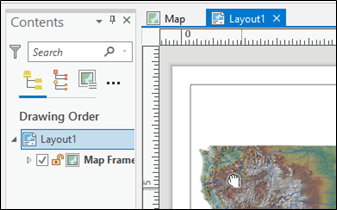
If you want to move or zoom in on the Paper, click on Layout (notice the “hand” cursor, this allows panning around):
To zoom in (rescale) the map itself, right click on the map > Activate:
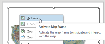
Notice under the layout tab, you have moved into “Layout: Map Frame” territory:
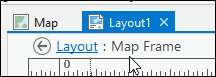
Now you can use the pan tool (hand) to click and move the MAP around within the map frame:

When you activate the map, you essentially revert it back to map view, but in the layout format.
Don’t give up on this. We know it is confusing!
If you haven’t watched the video demo on the assignment page yet, here’s a link: https://www.youtube.com/watch?v=lAdqrbOphMg
Keep working on these steps until you understand how to manipulate the map frames, the layout, zooming in and out of page and the data within the page, and panning in each.
Cartographic Elements
Scale bars:
We aren’t going to cover these in this course, because you don’t need a scale bar for a thematic map of the contiguous US. Only add map elements that are necessary. If scale is intuitive from landmarks and full boundaries, your viewers don’t need one.
But they are easy to add.
Insert > Scale bar > draw the box to make a place for it on the page.
Rules for scalebars:
- Round values
- Every value has a tick mark
- Reduce unnecessary tick marks
- Intelligent units of measure (no fractions: 0.33 miles)
- Scale bar text size should be similar to map labels (small)
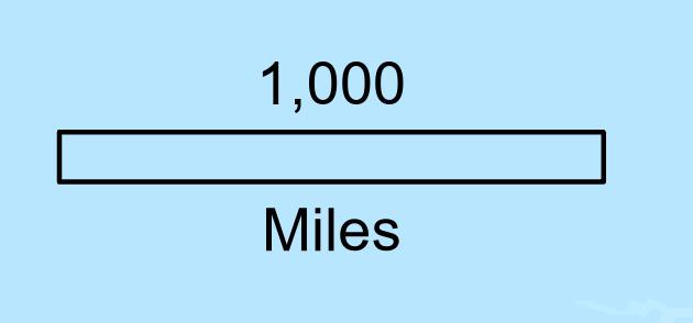
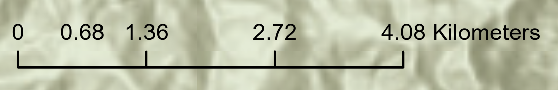
Bad scalebar:

The values are terribly awkward. Who can intuitively use 780 miles as a reference distance? There are too many division labels for the width - the first two distances are crunched together. The bar itself is graphically 'intense' and will pull the reader's eye away from the area of interest.
The scalebar style is an important consideration. Some agencies or employers may have a standard template that they use for all maps produced. Of course you will follow those protocols in that case. But for your own maps, or for simple figures, keep scale bars streamlined and visually simple.
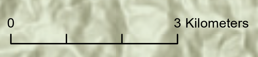
Better scalebar:
Not perfect for every occasion, but clean and simple.
Here's another set of examples:
This scalebar elicites the trombone Wah-Wah sound:

Awkward values - Dividing roughly 4 kilometers into 3 - messy fractions - a label without a tick mark...
While this scalebar might get a trumpet fanfare

North Arrows:
Again, not going to use it on this map because it is obvious where north is. Also, when displaying a large area like this and using a projection, north is only “up” in the middle of the map. (This is assuming you are displaying the continental US with the US conformal conic projection, still.) Look at the East and West coasts, you’ll see north is pointing “in”.
But they are also easy to add.
Insert > North Arrow > Draw the box to make a space for it on the page.
Rules for north arrows:
- Use only when north is not up
- Use only when there are no geographic landmarks to indicate the orientation
- Keep them very small and out of the way
- Reduced visibility (low contrast, unstylized)
Again, you may be in a discipline that requires a north arrow on every map you produce. That's great (even if it is a little old-fashioned). Do it. I'm just recommending some general considerations.
Legend:
These are a bit more complicated, so we aren’t going too far into the weeds. But let’s experiment a touch.
They are easy to add. You probably get the drill by now.
When you insert a legend, a new element is added to your Contents pane. This is where you control visibility of items displayed in the legend.
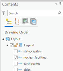
Legend item descriptions are dynamic. Edit Layer names in Contents pane and legend is dynamically updated.

Rules for Legends:
- Only show what isn’t intuitive to your reader
- Use every other means possible to convey meaning (titles, subtitles, smart symbology choices) to avoid redundant legends
- No jargon, underscores, fix spelling
- Numeric values MUST have units of measure
- Reduce significant digits
- Higher hierarchy than author/credits/ scale
- Legends don’t need to be called “Legend”
- Don’t repeat words. If the title says Nuclear Facilities in the US, don’t repeat Nuclear facilities in the legend.
Text
Titles:
Titles belong on formal maps, but not on figures or maps made for reports or presentation. The information found in a title can be provided elsewhere (in the report or presentation).
But for formal, stand-alone, maps:
Good Titles tell the viewer the What and Where of your map.
Bad Titles say things like:
- “Map of ...” (yes, we know it’s a map).
- “Map for Homework 2” (This isn’t elementary school).
- “Lab 3 Map” (see 1 and 2)
Here’s how to add a title:
- Insert tab > Graphics and Text > Rectangle Text
-
- There are other options, but rectangle will wrap
- Draw a rectangle on the map in the general area of your title
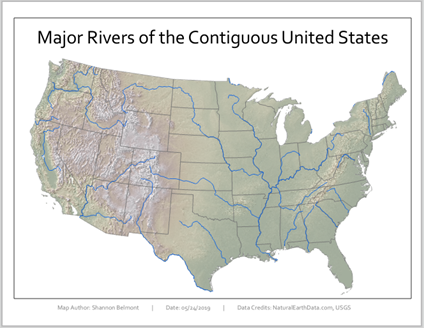
Type in something logical, for example:
“Major Rivers of the Contiguous United States.”
But that’s only logical if that is actually what your map is about.
Map author, date & data credits
Use the Text option from the Insert tab to add a text box with your name and the data sources for the data used in your map. (The data credits can always be found in the Data Descriptions at the beginning of the lab instructions.)
Map author, date, and data credits are usually placed at the bottom of the page and should not visually jump off the page. Keep them subtle, small, and pay attention to alignments. See example maps at the end of the document for examples.
Example:
Data Credits: NaturalEarthData.com, USGS
Service Layer Credits:
If you use a basemap, ESRI dynamically and automatically places data credits on the map. These are generally quite ugly and often in the way.
I recommend developing the habit of editing them in some way and moving them off the map.
- Click the Dynamic Text drop-down
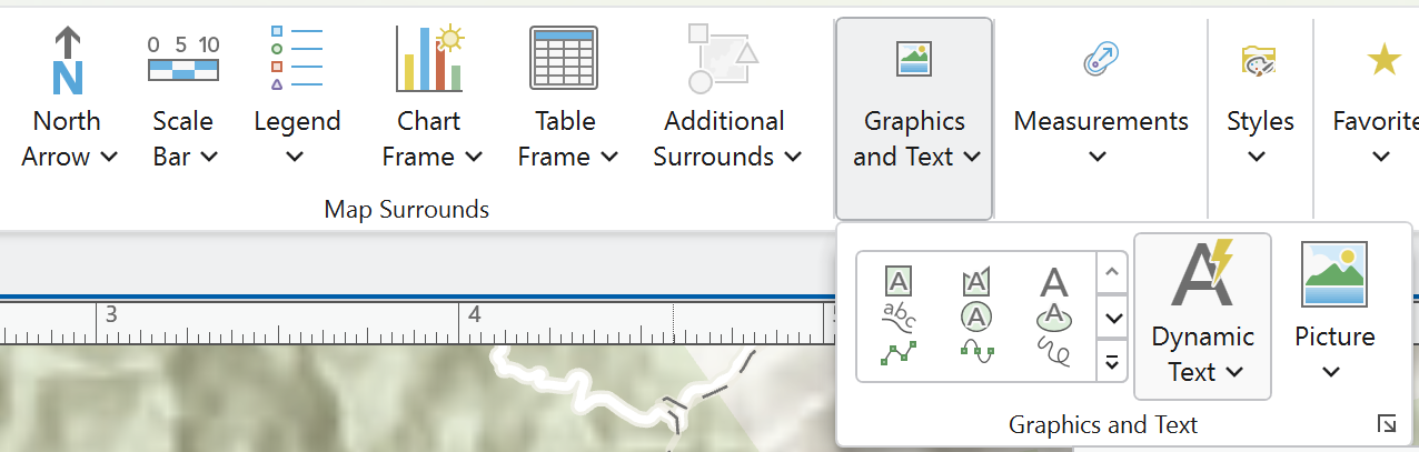
- Scroll down until you see “Service Layer Credits” in the Layout section. Select it.
- Click to draw a place for them.
- The credits are moved into a floating text box
- Slide it off the map page and summarize the credits (example Esri, HERE, Garmin) OR use the text tools to reduce the size, contrast, visibility to bring it into the Layout’s hierarchy.
Note: you can edit the font size, color, etc. by opening the Element tab on the right, by right clicking the text box > Properties, or right clicking “Text” in the ToC > Properties
Visual Hierarchy:
Hierarchy is the order in which the reader perceives things on your Layout.
You control the hierarchy by adjusting text size, position on the page, contrast of item (symbology, images, text) against background, etc.
Rules for hierarchy:
- Map is the most important Layout element
- Symbology has hierarchy – important features should have the highest visibility (color, contrast, size)
- Explanatory text is third most important (title, captions, legend items)
- Scale and author/data credits are at the bottom of the hierarchy rank. Size them accordingly.
- Reduce contrast (against background) of less important features.
- Page has real estate hierarchy.
- Top to bottom – high to low
- Left to right – high to low
Example of visual hierarchy in web design:

I pulled this from https://www.g2.com/articles/visual-hierarchy
It is a great article describing the principles and patterns of visual hierarchy by Daniella Alscher.
Alignments:
Alignments on the page convey attention to detail and professionalism.
Alignments reinforce sense of margins and create important page organization.
- Bottom align elements at the bottom of the page.
- Left align elements along the left side of page.
- Right text box to access “align” tools
Parting Words about Good Maps:
- Strive for balance on the page, using color, size, and line weight to draw attention to elements that have the highest priority on the map
- Don’t include information or elements that aren’t absolutely necessary
- Fit your data on the page to maximize detail
- Choose a scale and extent that is appropriate for your data
- Have a descriptive and clear title (or succinct caption)
- Choose intuitive data symbolization to support the map’s purpose
- Always have credits for the data in your map
Sharing Maps
Sharing Your Map
Page layouts are made of maps frames containing multiple layers of data with symbology and other layout details that must be compressed to a shareable file format.
And remember, the projects don’t contain the data, only point to the data’s location. So sharing requires that you package the data up with the project. There are many ways to share maps, but for this assignment you will create a PDF of your finished map. PDFs work very well to preserve the resolution and detail of your maps
Export to PDF
- Share tab
- Export Layout (these buttons change, could be a green arrow…)
- This opens the export tool
- Select the location to which you would like to save your exported map.
- Name it
- Set the save as type: PDF
- Set the DPI to 150 at a minimum, 300 if you want a very high resolution output with a correspondingly large file size.
- Export
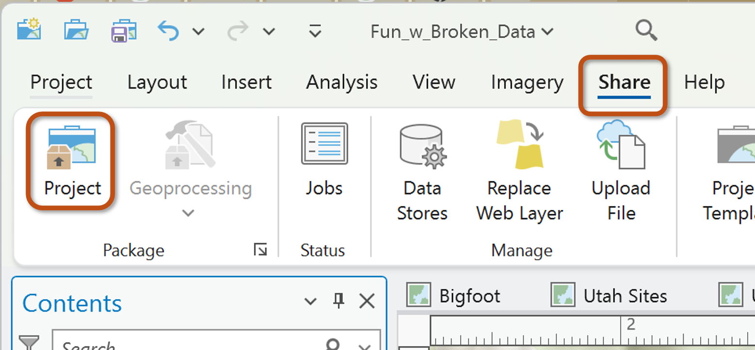
Another important way to be able to share your map Project is to package it.
Packaging is a way to 'gather' all the data shown in the contents pane into one communal location and 'attach' it to the map project. Neat and Clean.
Rasters will increase the file size of these project packages, so be forewarned.
How to Package:
Packaging requires a couple of small adjustments to your map project. Luckily, the Package Project tool walks you through everything you need.
Use the Share tab and find "Project" from the Package section:
The first decision you need to make is whether you will save the package to your files or upload it to your online ArcGIS account.
I'm saving to a file in this example.

Item Description Section
The Name sections allows you to navigate to the output file location and to name the packaged project.
The Summary and Tags are required.
(When I am saving projects for myself - to my desktop - casual-like, I don't labor over these. Sometimes I simply type a couple of letters. But of course, if you are sharing professionally, or uploading the file to ArcGIS Online, you would take the time to describe your project fully.)
Tags: Enter after each tag description.
The Options section:
From experience, I have learned to NOT include Toolboxes and History Items.
Do what you will, but know that including History items will cause errors if you have some unresolved errors or issues with the map project.
Hove over the blue "i" icon to learn more.
Now Analyze. Analyze before you Package the project to check for any issues that might prevent the project from saving.
If everything looks good, Package. You will be prompted to save the changes you made to the project summary and tags.
That's it!
Here are a couple of example maps: