
GNARLY Cartography
Researchers and practitioners need to effectively engage with a wide audience, and one of the best ways to communicate data and information is through maps. Maps improve our understanding of gateway communities in a few ways. The connections and linkages between communities, the landscape, and natural resources are made clear in maps. Furthermore, the software used to create maps includes powerful analysis and data collection to support plans and policies. And finally, from my own personal experience teaching map design to students, most people enjoy interpreting and looking at maps. Great maps are visually appealing, easy to understand, and can clearly communicate a message. This post is for any practitioners, students, or researchers who are thinking about how they can use maps to tell important stories about gateway communities and regions.
When designing any map, the first step is to identify one clear message you want to communicate. This message will guide all your design decisions, from color selection to choosing symbols and data. Every choice you make should clarify and strengthen that message. I will highlight this principle in the following set of maps about gateway communities. Each example contains important concepts related to gateway communities and includes some specific map design strategies. Hopefully these strategies will help you improve your own communication through map design and cartography.
Map 1: Visualizing the extent of gateway communities.
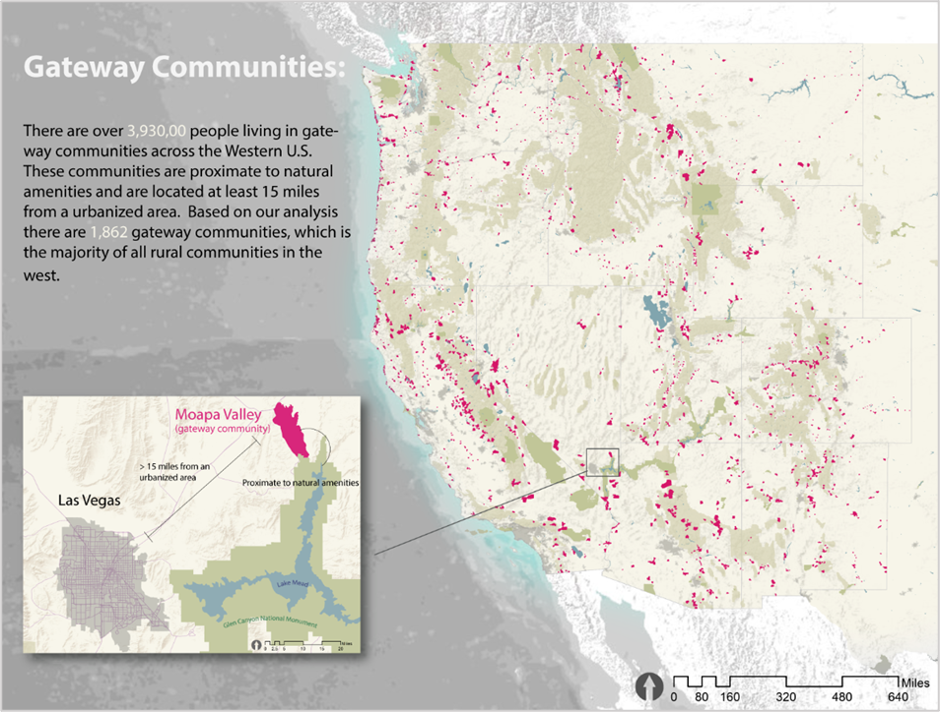
This purpose of this map is to show that there are a lot of gateway communities, and that a lot of people live in them. I wanted this map to set up a larger argument that there is a need for greater attention to support these communities. The challenge was to map the location of over 1,800 communities without creating a cluttered map. The most important information was the number and location of the gateway communities, so I chose a bright color that stands out from the background. I wanted to avoid overlapping features, so I chose to use the municipal boundaries (polygons) of the communities instead of points or circles representing cities. Using a solid color instead of an outlined color also prevented visual overlap.
The secondary purpose of this map was to provide a visual reference for our definition of gateway communities. So not only does the inset in the lower left corner “zoom in” to a specific gateway community, the additional text and diagram shows that is both proximate to a natural amenity as well as 15 linear miles away from an urbanized area.
Finally, I use text in the below the title as an infographic to highlight quantitative data to support the main message. Ideally, when you look at this map you quickly understand that there are a lot of gateway communities and we should be supporting the 3.9 million people living and working in these communities.
Map 2: Learning from the experts and mapping one gateway community.
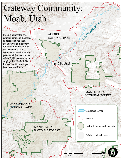
The purpose of this map is to show that Moab, Utah, is surrounded by national parks and public lands. This proximity to natural amenities and public lands drives tourism and population growth in the city. I put the most important feature, Moab, in the approximate center of the map and surrounded the city with prominent outlines of parks and national forests. When the background or “basemap” is a lighter color, darker or more saturated features and colors will stand out (and vice versa when the background is dark). Even if you have not been to Moab, I think you will get the sense that it is surrounded by national parks and forests just by looking at this map.
This map also demonstrates an effective strategy to improve your map design. The strategy I employ and recommend to all my students is imitate the design choices in other visually appealing and effective maps. You can learn from maps if you pay attention to the cartographer’s design choices related to layout, color, and symbology. Map 3 is made by the National Park Service, and because so many people travel to Moab visit the national parks and trails, I used this selection of colors and symbology in my own design. Remember, you can learn from the experts by studying their design choices. Pick a map that you think looks great and try to mimic the design choices.
Map 3. Canyonlands National Park (from http://npmaps.com/canyonlands/)

Map 4. Visualizing regional commuting patterns
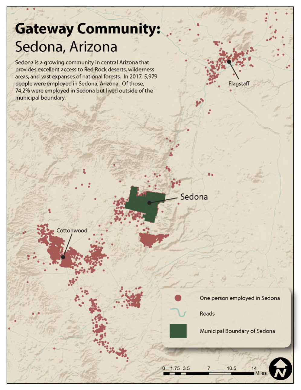
The regional nature of the challenges gateway communities face is apparent when mapped. For example, rising property values and restrictive development in gateway communities can force much of the lower income workforce to move to neighboring towns. This causes problems like traffic congestion, a lack of affordable housing, and displaced infrastructure costs. My goal with this map was to illustrate that most of the workforce in Sedona, Arizona, live outside the community and commute into Sedona for work. Each dot represents one worker who commutes to Sedona and the wide distribution of points reveals that workers are driving to Sedona from well beyond the municipal boundaries. This map can help people understand how housing and employment dynamics are shared regional challenges.
Map 5: Simplicity and clear communication
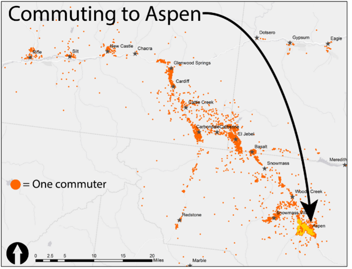
This last map demonstrates the core concept of clear messaging. This map shows the same data as in Map 4, but with a straightforward visual cue and simple design. I use the title of the map and the arrow to communicate the movement of people to Aspen. Despite the complexity of obtaining this data, the message this map tells is simple. Map design is often most effective when data is presented simply and without clutter.
Presenting data and ideas through maps can support engagement with a wide range of audiences. These maps are not intended to be “perfect” examples of map design, in fact I see improvements in each I would like to make, but they can serve as a guide for some basic map design principles. Hopefully looking at these maps has you thinking about how you can use maps to better communicate your own work and research on gateway communities.
 Philip Stoker Ph.D. is an Assistant Professor of Planning and Landscape Architecture in the College of Architecture, Planning and Landscape Architecture at the University of Arizona. Philip holds a Ph.D. in Metropolitan Planning, Policy, and Design from the University of Utah where he completed his thesis on urban water use and sustainability. His academic foundations are in ecology, planning, and natural resource management. He has conducted environmental and social science research internationally, including work with the World Health Organization, Parks Canada, the National Park Service and the Vancouver 2010 Olympic Games.
Philip has expertise in urban water demand and the integration of land use planning with water management. His research on urban water demand has focused on how land cover, built environmental characteristics, social conditions, and demographics all interact to influence water use in Western U.S. cities. Philip teaches Introduction to GIS, Environmental Spatial Analysis, Sustainable Development, and Sustainable Cities for both graduate and undergraduate students.