Summary for Categorical Data
The Statistical Abstract of the United States contains
a plethora of information about the demographics, education, and economy of the United States obtained by the US Census Bureau. The abstract includes many
pages of tables of data pertaining to a variety of variables. While the information is intriguing, sorting through the abstract is a daunting task.
Descriptive statistics, consisting of numerical and graphical summaries of the data, are very helpful for identifying trends and patterns, outliers and anomalies.
Categorical data described in the Statistical Abstract of the United States include information about the distribution of race in the American population and the use of
rural lands.

Numerical Summaries for Categorical Data
Numerical summaries for categorical data consist primarily of frequencies and proportions, both are often displayed in tables showing the values for each level of the variable. Since the data are categories rather than numbers, familiar summaries such as averages are not appropriate.
A frequency table displays counts corresponding to each level of a categorical variable.
The Statistical Abstract of the United States, 2012 reports on the distribution of races in the US. These data are shown in the frequency table below. The numbers are in thousands. The first six categories refer to people of a single race.

A relative frequency or proportion is found by dividing the count for a particular level by the total number of observations.
The relative frequency table presents the same information as relative frequencies or proportions out of the whole as seen in the table below.

Graphical Summaries for Categorical Data
There are many different types of graphics used to display categorical data, however, the most common are the bar chart and the pie chart.
Bar Charts
A barchart displays category frequencies in bars and are useful for making quick comparisons.
A bar chart is a graphic for the display of categorical data in which bars correspond to the number of observations in each level of the categorical variable being represented.
Compare the frequency table and chart below. In the bar chart, the heights of the bars correspond to the frequencies in the
respective categories. For example, 14,674 thousand people in the US in 2012 identified as Asian, thus the height of the bar corresponding
to this category is 14,674.
Notice that the column 'Total' in the table is itself a summary of the data and is not displayed in the barchart.
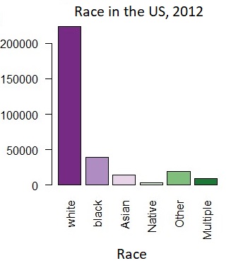
The ordering of the bars in a bar chart is flexible. In the bar chart above, the first four categories correspond to single races; these are ordered by height. The other two categories have been placed later as they represent 'all other single race' populations and populations that claim multiple racial backgrounds.
Pie Charts
A pie chart is useful for displaying which components make up the whole.
A pie chart is a graphic displaying categorical data in which wedges of a circle correspond to the proportion of observations in each level of the categorical variable being represented.
Compare the relative frequency table and the pie chart below. In the chart, the areas of the wedges correspond to the relative frequencies shown in the table. For example, the relative frequency for the category 'White' is 0.724 and the proportion of the circle contained in the dark purple sector is 0.724.

In a pie chart, the area of each wedge is proportional to the relative frequency of the corresponding category. Pie charts are very common but they are denigrated by many statisticians. It can be difficult to make comparisons between categories presented in the wedge format. However, they do quickly give an idea of the portion of the group that corresponds to each category.