Box Plots
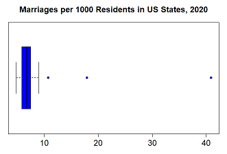
This diagram, a boxplot shows the distribution of the number of marriages per 1000 people in the 50 United States in 2020.
The vertical line on the left indicates the minimum, the blue box shows the middle 50% of values and the vertical line on the right corresponds to
the state with the maximum number of marriages per 1000 residents.
How would you describe this distribution?

A boxplot is a common graphical summary for numeric data. It provides a simple summary of a variables distribution. A boxplot (or box-and-whisker plot) consists of a box that extends from the lower to the upper quartile, a line through the box at the median, and lines or "whiskers" that extend to the minimim and maximum values in the data. A common variation on the box plot has the whiskers extend to the minimum and maximum values that are not outliers with the outliers marked with points beyond. Boxplots can be either horizontally or vertically oriented.

Boxplot 1: whiskers to minimum and maximum.

Boxplot 2: outliers shown.
The mean of a variable is not an essential part of a boxplot though it is sometimes added, marked with a star or similar. The width of the boxplot does not affect the interpretation.
In this boxplot, the outliers (values that are 1.5×IQR above the upper quartile) are displayed as points beyond the upper whisker. It is clear from the
box that most states have a small number of marriages per 1000 residents (between 5.8 and 7.5) and that one particular state is largely responsible for the
heavy right skew. It probably won't be a surprise that this state is Nevada. There were nearly 41 marriages per 1000 people there in 2020. The other two outlier
states are Arkansas (10.7) and Hawaii (17.9).
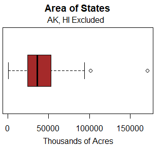
The boxplot shows the distribution of the land area of US states in acres. Notice the two outliers shown as points beyond the upper whisker. Since Alaska was
excluded from the reporting, the further outlier is Texas and California is the oulier just beyond the end of the whisker.
Even without the outliers, the distribution is somewhat right skewed - the right tail is longer than the left and the line denoting the median is left of center
in the box. The width of the box itself is the IQR.
Constructing A Boxplot
To construct a boxplot,
- Compute the minimum, lower quartile, median, upper quartile, and maximum of the data (the five number summary).
- Draw a box that extends from the lower to the upper quartile.
- Draw a line through the box at the median.
- Draw whiskers that extend from the box to the minimum and maximum.
The five number summary consists of the minimum, lower quartile, median, upper quarlier, and maximum of the data.
Boxplots and Histograms
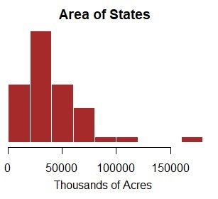
Boxplots and histograms are both graphical methods for displaying numeric data and some of the same information can be obtained from either. Boxplots do not show as much detail as histograms do, but they give a quick visualization of the spread of the data.
Use the applet to compare histograms and boxplots. Drag the mouse across the upper canvas to create a histogram. A boxplot of the same distribution will be shown in the canvas below. Choose whether to display outliers and separate points. If the show mean box is selected, the mean will be shown on the boxplot as a green x.
Boxplots are useful for comparing distributions of multiple variables.
From the boxplots, we don't see a lot of detail about the distributions, however, from the display it is easy to make some comparisons. We see that the lower quartile
is about the same for the two distributions however, the median for the forest distribution is much higher than the median for the crop distribution; in fact, the
forest median is higher than the upper quartile for the crop distribution.
