How to use the Equality Interactive Dashboards
The following steps outline how to navigate the Equality Interactive Dashboards.
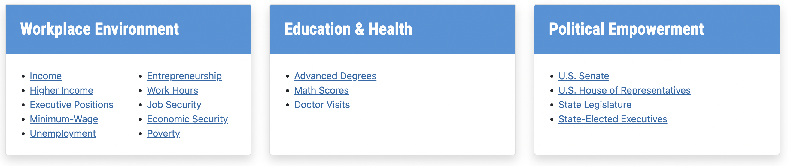
Step 1: Select Category and Topic
Decide which category is of interest and then select a topic within that category to view the associated dashboard.
Step 2: View Dashboards
Hover over the dashboard elements for insightful tooltips.- National Map: States are shaded from light (best ranking state) to dark (worst ranking state). Click a state to see where it falls in the national distribution as shown by the box plot.
- Longitudinal Data: The bottom pane plots relevant data or other insightful charts to highlight gender disparity over time. The disparities were calculated so that a positive value indicates women are performing better than men, and a negative value indicates men are performing better than women.
- Box Plots: These show the most current state data plotted over the indicator metric; the higher the dot, the better the state's performance. The dot for Utah is bigger and in maroon.

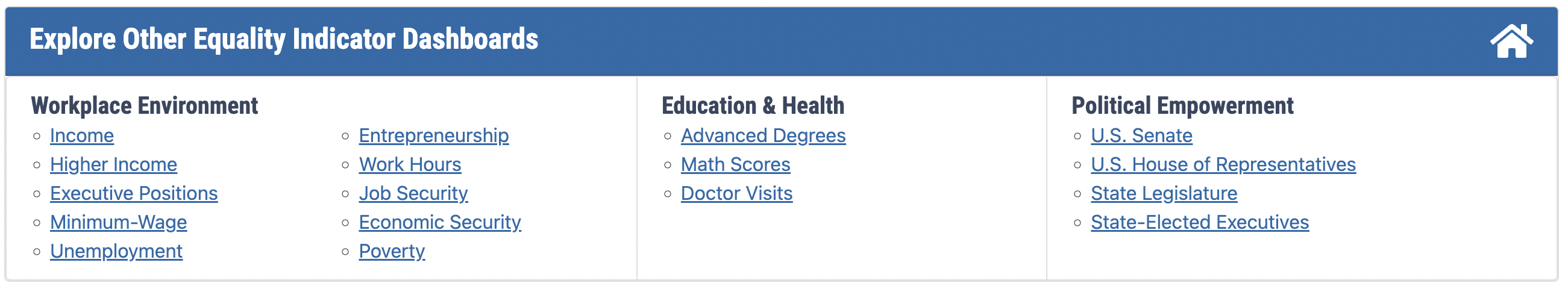
Step 3: Navigate to Other Dashboards
Towards the bottom of each page, navigate to other dashboards by selecting from the “Explore Other Equality Dashboards” links, clicking the graph button to go to "Utah's Path to Equality" dashboard, or clicking the home icon to return to the landing page with the WalletHub overview dashboard.
If you have other questions or comments, please contact uwlp@usu.edu.