Alt Text Basics
What Is Alt Text?
Alternative text (alt text) is a short description of an image. If an image fails to load on a document or web page, then the alt text will be displayed in its place. This makes effective alt text very useful if users have a poor internet connection.
Alt text is necessary for users who rely on assistive technology such as screen readers. Screen readers are a type of interactive software that reads the content of a screen. They make it possible for people who are blind or low-vision to read and interact with digital documents, forms, and web pages. Good alt text is very important to these users because it allows them to get the same information and experience as sighted users.
Writing Alt Text
Here is a basic overview of how you can start writing alt text for your images.
- Look at the image and its context on the page.
- The aim of good alt text is to convey the same information that a sighted user would get from the image. Summarize and describe the image based on both its content and context. Try to be both descriptive and succinct.
- Always end alt text with a period, even if it isn’t a complete sentence. This ensures that a screen reader will pause at the end of the alt text.
- An image can be marked as decorative if it doesn’t contain any relevant information. Some programs may include a button or a checkbox that will mark the image as decorative, and some may not. In that case, simply add “” to the alt text field.
- Never include “picture of”, “graphic of”, “image of”, or similar language. Screen readers identify images as images, so including any of these creates repetition. However, it may be appropriate to identify flow charts, graphs, or cartoons.
- Always add alt text! If an image doesn’t have alt text, the file name is used in its place, or it’s skipped over entirely.
Examples
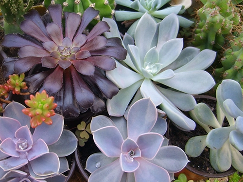 The alt text for an image can differ depending on the image's context on the page. If the image above was part of a page about photography, the close-up, detailed nature of the photo should be included in its alt text. If it were part of a page about houseplants, “several varieties of succulent plants” may be sufficient. If it's on a botanical page, it may be a good idea to include the scientific names of each of the plants. If those are noted elsewhere, a detailed description of the plants would be appropriate.
Image alt text should be both descriptive and succinct. If this image came from an architectural website, “a house" would be far too succinct. However, “a large L-shaped house with a brick and stone exterior, a two-level four car garage, brick stairs and an arched entryway, 25 windows, 4 big trees, a landscaped yard with bushes and grass, planter boxes at three sets of windows, a curved driveway, an exterior chimney, a gray shingled roof, white trim, and several dormers” is probably too descriptive, especially since an architectural page would likely describe it elsewhere.
A better option is “The exterior rendering of a large, elegant, Tudor-style home, with a large driveway, a four-car garage, and a landscaped yard.” 
This is an example of an image that should be marked as decorative. It doesn’t give any information to the reader. It’s an image that most people would likely glance at, deem unimportant, and move on from. Marking it as decorative allows users of screen readers to do the same.
How to Add Alt Text to Images
The process for adding alt text to images varies slightly depending on the software you’re using. We’ve linked instructions for adding alt text in some common programs below.
- Canvas:
- Microsoft Word:
- Microsoft PowerPoint:
- Adobe Acrobat:
AI and Alt Text
There is also the option of writing Alt text using AI. To do this, all you have to do is:
- Upload the image to the AI system of your choice. It can be helpful if you give the AI context for the image, such as the page it’s on, the purpose of the image, etc.
- Ask for it to write alt text for the image within any parameters you have set (i.e., character limit, word count, etc.)
- Review and edit the alt text it gives you.
- Upload the alt text to the image and select Save.
Here is a list of recommended AI systems to create alt text for your images: