Using the Pope Tech Dashboard
When you first log in to Pope Tech, you will see the dashboard for the site or sites that you have access to. The dashboard contains a lot of information and may be overwhelming at first. We encourage you to take a few minutes to familiarize yourself with the different components and ways to look at your site's accessibility information.
Consider these notes to help you in your work to create more accessible content at USU.
Configuration
We generally recommend using the default dashboard settings. However, Pope Tech makes it possible to configure the way your data is displayed using the buttons in the upper-right corner of each widget.
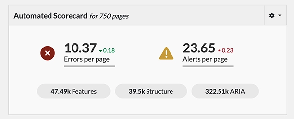
Automated Scorecard
This widget summarizes the results of your website’s latest scan. You can click on any of these five categories to see more information.
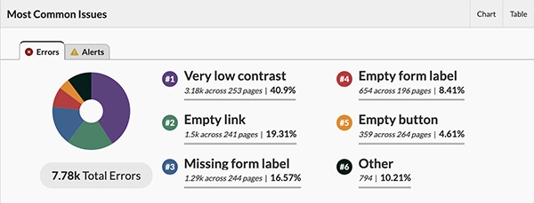
Most Common Issues
This section displays information about the errors and alerts that show up most frequently on your website. This is a great place to start! The most common issues are often found in website templates and resolving them is a quick way to improve your site accessibility.
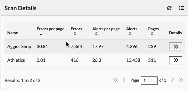
Scan Details
This section of the dashboard shows each individual site and an overview of the issues it contains.
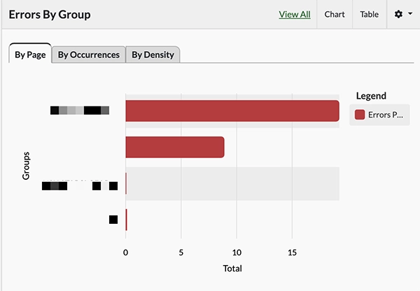
Errors by Group
Whether you manage a single site or sites across multiple groups, this section of the dashboard displays errors by page, occurrence, or density. If you only manage sites in one group, this widget won’t be as useful. If you manage multiple sites, this will allow you to see which groups of websites are most problematic.
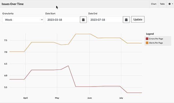
Issues Over Time
At the bottom of your dashboard, you’ll find a graph that shows how your site accessibility has changed over time. You can view daily, weekly, monthly, quarterly, or yearly data by adjusting the “Granularity”, and changing the time period using the date fields. Use the “Update” button to apply changes you make to the filters.
For more information, review Pope Tech’s page about drilling down into dashboard data.