Color and Accessibility
Color is an essential aspect of design, and it is important to make sure you are using color in a way that doesn’t create barriers for users with disabilities. Ensuring color is accessible is a key aspect of accessibility that benefits all users, including those with low vision and color blindness. This page provides essential tips and tools to help you use color to create accessible digital content.
Color Contrast for Text
Color contrast is the difference between the foreground element (like text or an icon) and the background color behind that element. When an element has poor color contrast, it can make it difficult to read for everyone, and impossible to read for some users. Good color contrast makes your content more usable for everyone and makes it accessible for low-vision or colorblind users.
Our standard for color contrast comes from the Web Content Accessibility Guidelines, and there are a number of tools and resources to help you check your content to meet the standard (see below). When using any of the tools, look for the Web Content Accessibility Guidelines (WCAG) AA standard. You don’t need to understand exactly what that means, but it is important to know that our standard is AA and not AAA.
Most color combinations from the USU Web Color Palette are accessible as long as you’re pairing a light color with a dark one. However, be aware that the “Bright Light” and “Green Light” colors tend to have low contrast when paired with white. Either avoid using those colors or make sure the font size is large enough to have proper contrast (text larger than 18pt font has a lower required contrast ratio).
Color Contrast Examples
Having good color contrast does not mean that you have to use black and white text. There are many different color combinations that can provide a good user experience and meet accessibility requirements. It can sometimes be difficult to tell, so we recommend using a tool to check the contrast. Consider the examples below:
Tools to Check for Color Contrast
Our recommended website accessibility tools, WAVE (for page-level checks) and PopeTech (for site-level checks), both have built-in tools to check for color contrast. In addition, there are websites such as the WebAIM Contrast Checker or a free application called the Colour Contrast Analyzer (CCA) that make it easy to select two colors and determine whether they have adequate contrast.
Check for Color Contrast Using WAVE
We recommend using the WAVE tool as an easy way to check your website for color contrast issues (tips on using WAVE here). Once you run WAVE on your website, this icon will show up wherever you have text with poor contrast:
 You can also click on the WAVE Contrast tab to see specific issues. Use their built-in tool to try out different colors by sliding the tabs to lighten or darken a color until you find one that passes:


Once you have found a more accessible color combination, you can edit your website to make that change. Then run WAVE again to make sure it is fixed! If you want to check for all of the contrast errors across an entire site, the Pope Tech tool can do a sitewide check.
Check for Color Contrast Using the Colour Contrast Analyzer
The Colour Contrast Analyzer (CCA) is a free tool that you can use to check contrast for any type of content. Once you download the tool (available for Windows or Mac), use the eyedropper tool to select any two colors to determine if they have adequate contrast:

Additional Color Contrast Helps
If you are interested in additional information about color contrast or would like more examples, take a look at the resources below:
- Contrast and Color Accessibility: Understanding WCAG 2 Contrast and Color Requirements
- Contrast and Color Accessibility: Evaluating Contrast and Color Use
- Pope Tech Color Contrast Documentation
- Color Contrast Examples and Tools to Fix
Color Contrast for Non-Text Visual Elements
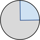
Besides text, other non-text visual elements also need to have a required contrast of 3:1 (lower ratio than regular text). Non-text visual elements include images, charts, and buttons. Contrast should be considered both within the non-text element and between the non-text element and the background it is on. Consider the examples below:
 This chart has poor contrast both within the chart and against the white background.
 Adding a border to the chart creates an adequate contrast within the chart and against the white background.
 Changing the colors on the chart can also provide the necessary contrast with the chart and against the white background.
Use of Color
Color is a useful way to convey information, but it should never be the only way. When using color, also include another indicator, such as a symbol or description, in order to be fully accessible. Consider the following table that uses color to indicate whether an event is indoors or outdoors:
| Event (outdoor events in green) |
|---|
| Welcome Back Party |
| Freshman Orientation |
| Basketball Game |
| College Tour |
It works great to use color, but there should also be another way to indicate the same information. Consider a couple of options below:
| Event (outdoor events in green with ) |
|---|
| Welcome Back Party |
| Freshman Orientation |
| Basketball Game |
| College Tour |
| Event | Location |
|---|---|
| Welcome Back Party | Outdoors |
| Freshman Orientation | Indoors |
| Basketball Game | Indoors |
| College Tour | Outdoors |