Using Accessible Colors in Canvas
Color is an important aspect of designing a course. However, certain color combinations can make it difficult for someone to read. It is important that proper colors are used in your course so that no one has trouble accessing the information.
Color Contrast
Color contrast refers to the difference between the color of your text and the color of your background. If there is not sufficient contrast, the content will be difficult to see for everyone. For those with low vision, it may even be unreadable. See the example image below.

Color is often used to emphasize a word or phrase. Instead of coloring or highlighting text, consider using bold or italics. These options not only avoid issues with color contrast but also make it so that the emphasized text will be announced to a screen reader user.
If you decide to use color, light-colored text should be used on a dark background, and dark-colored text should be used on a light background. Make sure that the colors you choose do not create issues in the Canvas Accessibility Checker.
Using Color to Convey Information
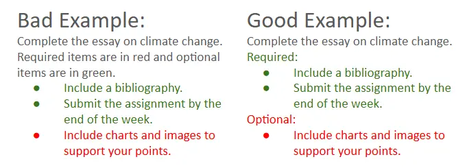
It’s also important that you don’t use only color to convey information. For example, listing the required elements of an assignment in red could impact someone who is colorblind, as they may not be able to decipher what is required versus optional in the assignment. If you are using color to convey information, include another indicator such as a symbol or description.

