Brand Standards: Salesforce Email
Call to Action
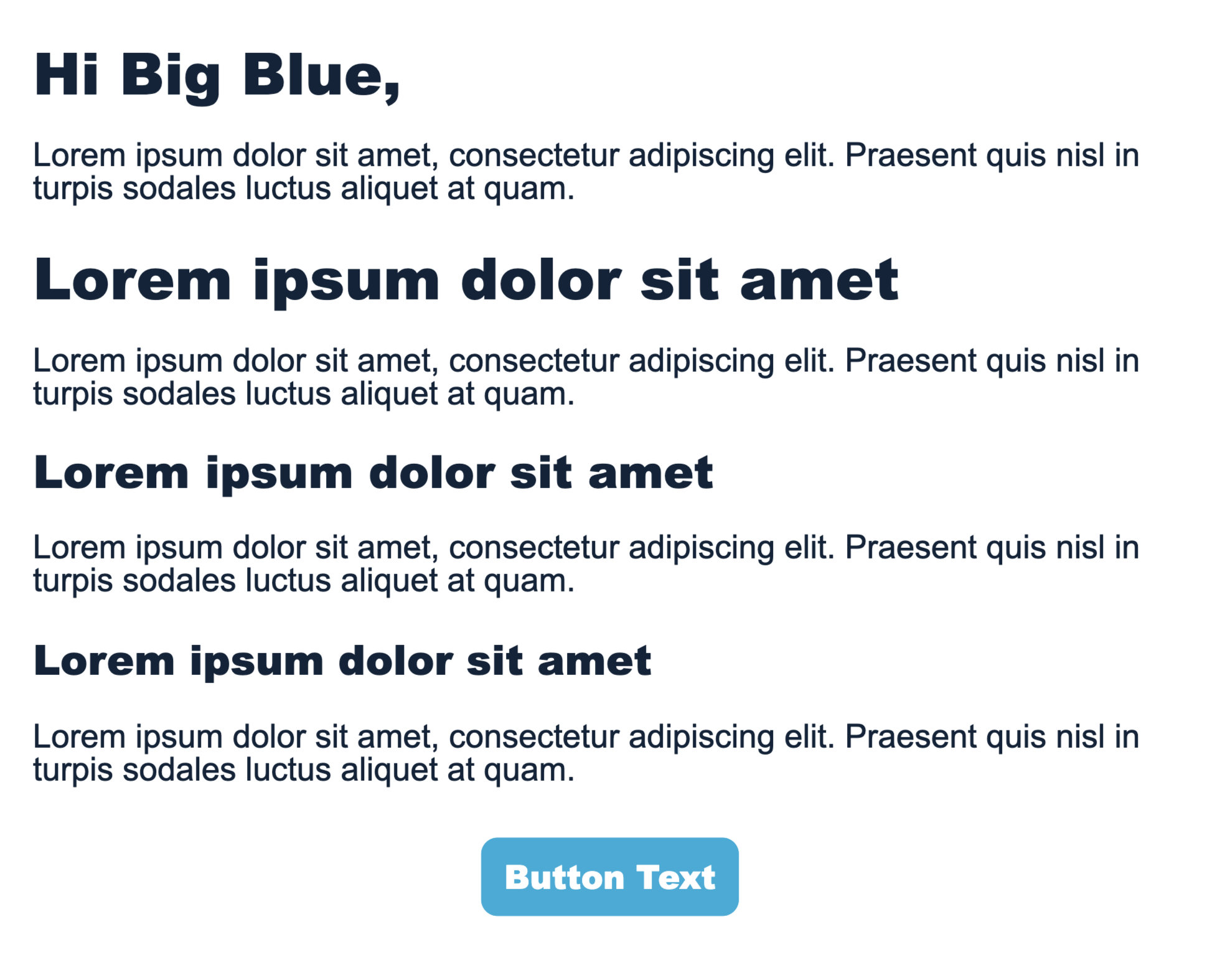
- Create a simple, actionable, inspiring call-to-action (CTA). No amount of design can help a poor CTA. A good CTA doesn’t merely amplify the act of proceeding; it amplifies the value of it. Your button should set the expectation of what your viewer will encounter next
- Use urgency to encourage action, where applicable
- Use center positioning and generous padding to draw eyes to the button
- Padding: 10px on all sides (top, bottom, left, right)
- Corner Radius: 8px
- Use USU-web suggested contrasting colors to draw attention to the CTA button
- Color: Green Light (USU web color palette)
- Font Size: 14 point bold