Components
In the Delphinium Layout Editor, components are represented by "Component Tiles". Components are grouped into the following categories: Content, Progress, Dashboard, Game Elements, and Description.
Component Tiles
The template that you choose should have all of the components that you will need for the layout of your course. You may add additional components to further customize your Delphinium interface. We recommend that you do not duplicate components across different tabs, for this may cause issues with the component.
Content
Content components display information about Canvas modules and assignments, they also display information about student progress.
Iris Content Map
The Iris Content Map visually displays the entire course at a glance in a visually appealing way. This template is a good option when the order of assignment completion does not matter.
Box Module Map
The Box Content Map is a quick and easy visual layout that displays the entire course content at a glance. This makes it easier for students to understand their progress, celebrate success, and make goals because it clearly shows them where they are, where they are going, and where they have been.

Cafeteria Module Map
The Cafeteria Module Map visually displays the entire course at a glance in a visually appealing way. This module is designed specifically to support cafeteria-style or competency-based course designs. Students are free to choose which assignments to complete, at their own pace and sequence, but assignments are periodically closed for grading and no longer available.

Progress
Progress components display information about student progress in assignments.
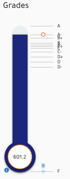
Current Grade
This component displays information about the student's grade. The data displayed there is a summary of data available in Gradebook tab. It helps students keep their grade top of mind. It also displays an estimated potential grade for the class.

Milestone Tracker
The Milestone Tracker creates urgency and provides students with incentive make progress in courses designed without due dates or sequence of assignments. The Milestone Tracker displays students' progress towards point milestones (e.g., 100 point milestone, 200 point milestone). Students earn bonus by staying ahead of point milestones and penalty for falling behind.
Tag Tracker
The tag tracker shows students progress on groups of tagged assignments. For example, teachers might group assignments with the same assignment type, topic, unit, or competency. Then students can clearly see how many points they have earned out of the points possible for that tag.
Grade Tracker
The tag tracker shows students progress on groups of tagged assignments. For example, teachers might group assignments with the same assignment type, topic, unit, or competency. Then students can clearly see how many points they have earned out of the points possible for that tag.
Dashboard
Dashboard components display information related to the course like time to course end and % of assignments completed.
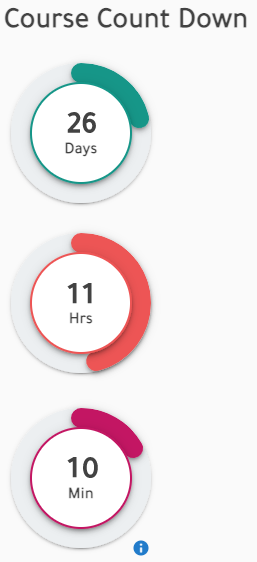
Course Countdown Timer
This component informs students about the time remaining till the end of the course. Its purpose is to create a sense of urgency to encourage students to perform in the course.
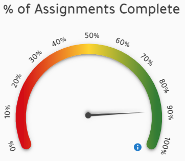
Course Progress
This component is used to show students the assignments completed in the course. Its value is computed as the number assignments with scores divided by the number published assignments in the class.
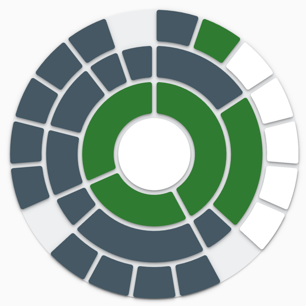
Course Stats
This component displays data for all completed assignments, or for the most recent 10 completed assignments so that students can see if their latest work is trending in the right direction or not. This can provide some encouragement and hope for students who get a rough start in the class but start improving their grade.
Course Stats is a dynamic component that changes views depending on whether or not the "Milestone Tracker" is also in a course.
If "Milestone Tracker" IS in the course, "Course Stats" displays four horizontal data bars
If "Milestone Tracker" is NOT in a course, "Course Stats" displays one circular data bar

Game Elements
Game element components add game-like experiences to courses.
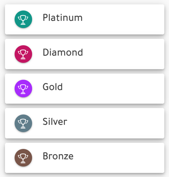
Leaderboard
The Delphinium Leaderboard evenly distributes students into 5 performance levels, each with their own ranking (e.g., 1st, 2nd, 3rd, etc.). This is a powerful tool for creating a more "social presence" between students.
Something important to note, is that each student's data is displayed in a "leaderboard tile" including the student's rank in the performance level, and an alias for each student used to protect student's anonymity and privacy.
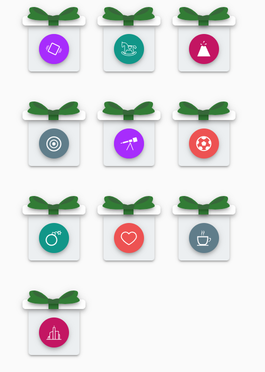
Prize Boxes
This component is used to show students the assignments completed in the course. Its value is computed as the number assignments with scores divided by the number published assignments in the class.
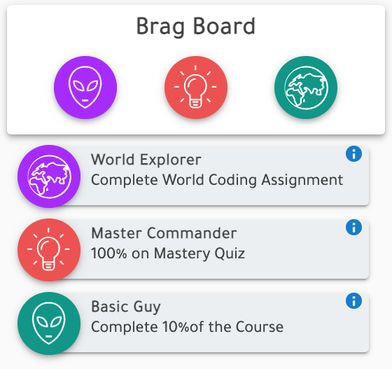
Achievements (Beta)
This component is used to direct students towards desirable behavior in a course by celebrating important course accomplishments. When students complete the requirements for a specific achievement, the achievement is unlocked and the success is shared with their peers in the leaderboard.
Avatars
Avatars allow students to express their individuality in a fun and creative way in a course. They can customize their avatar and unlock additional customizations by earning points and leveling up their characters by completing assignments.
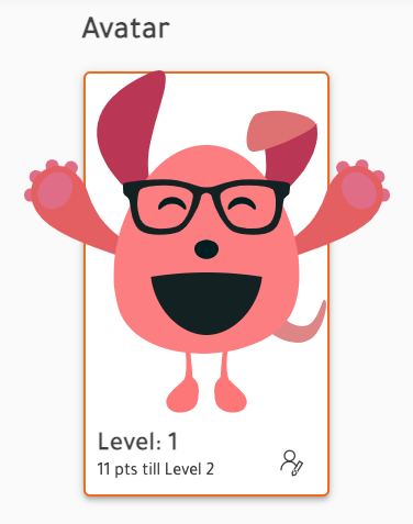
Description
Description components add text-based information to a layout.
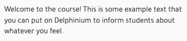
Text Box
Text boxes are useful when you want to include styled text, links, and media to a layout.
Message Box
Message boxes are useful when you want to highlight text that you add to a layout.

Title Box
Component automatically added with default text, but you can add additional title boxes as headers if so desired.
